Supporting files for VG3 quests are part of a single archive that you can download here.
This assignment continues with the CharacterBuilder scene started in the prior tutorial.
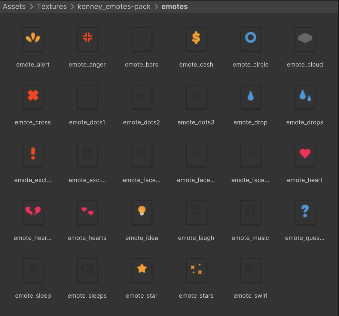
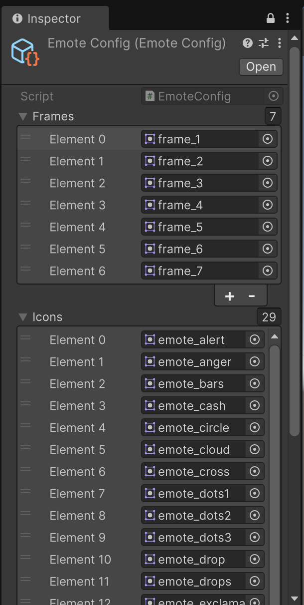
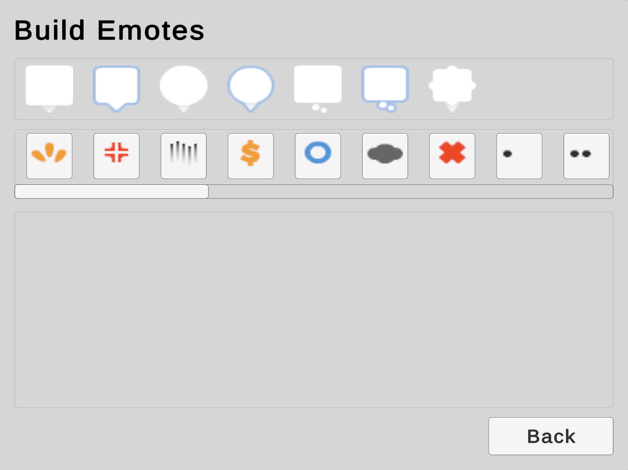
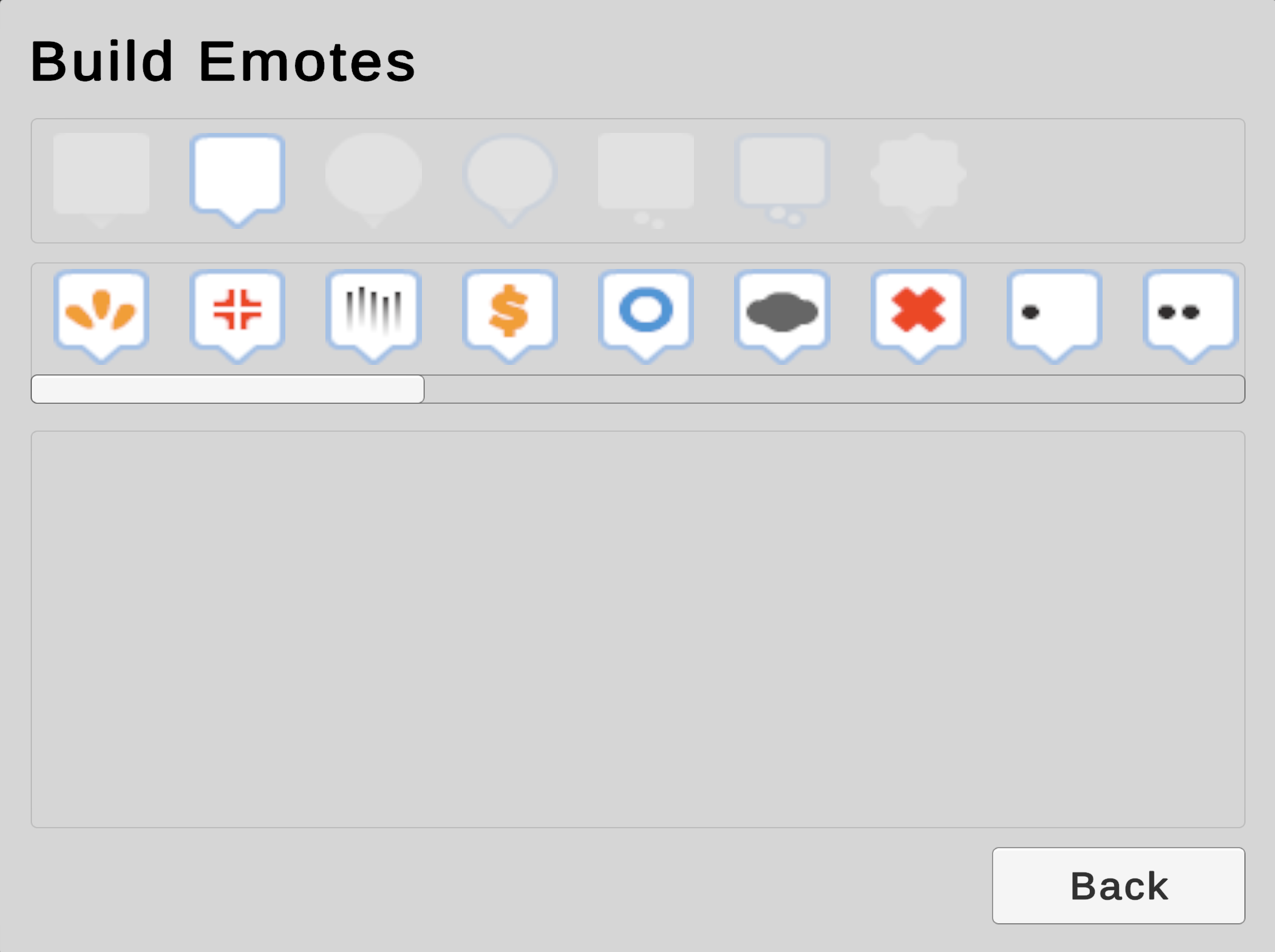
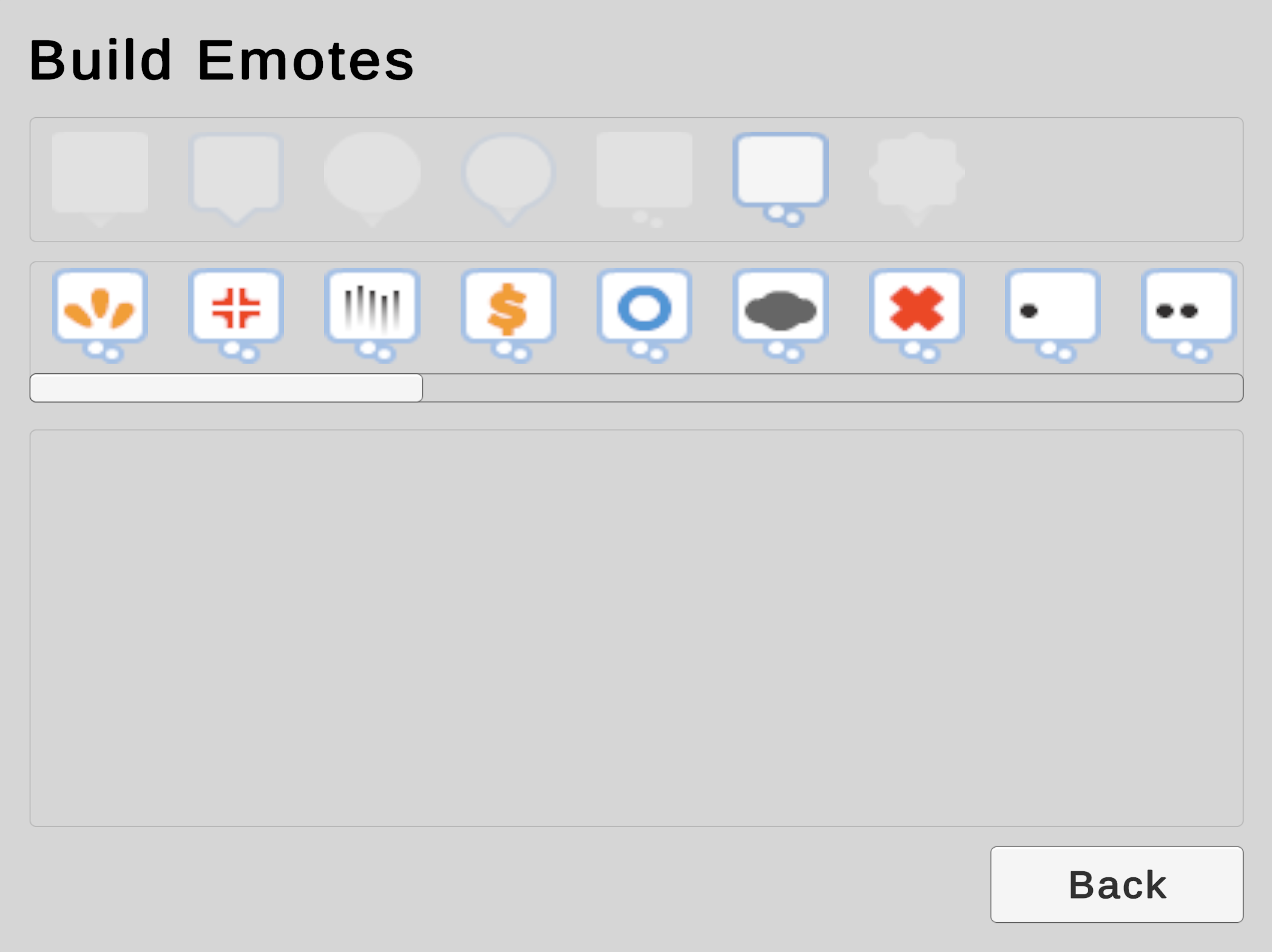
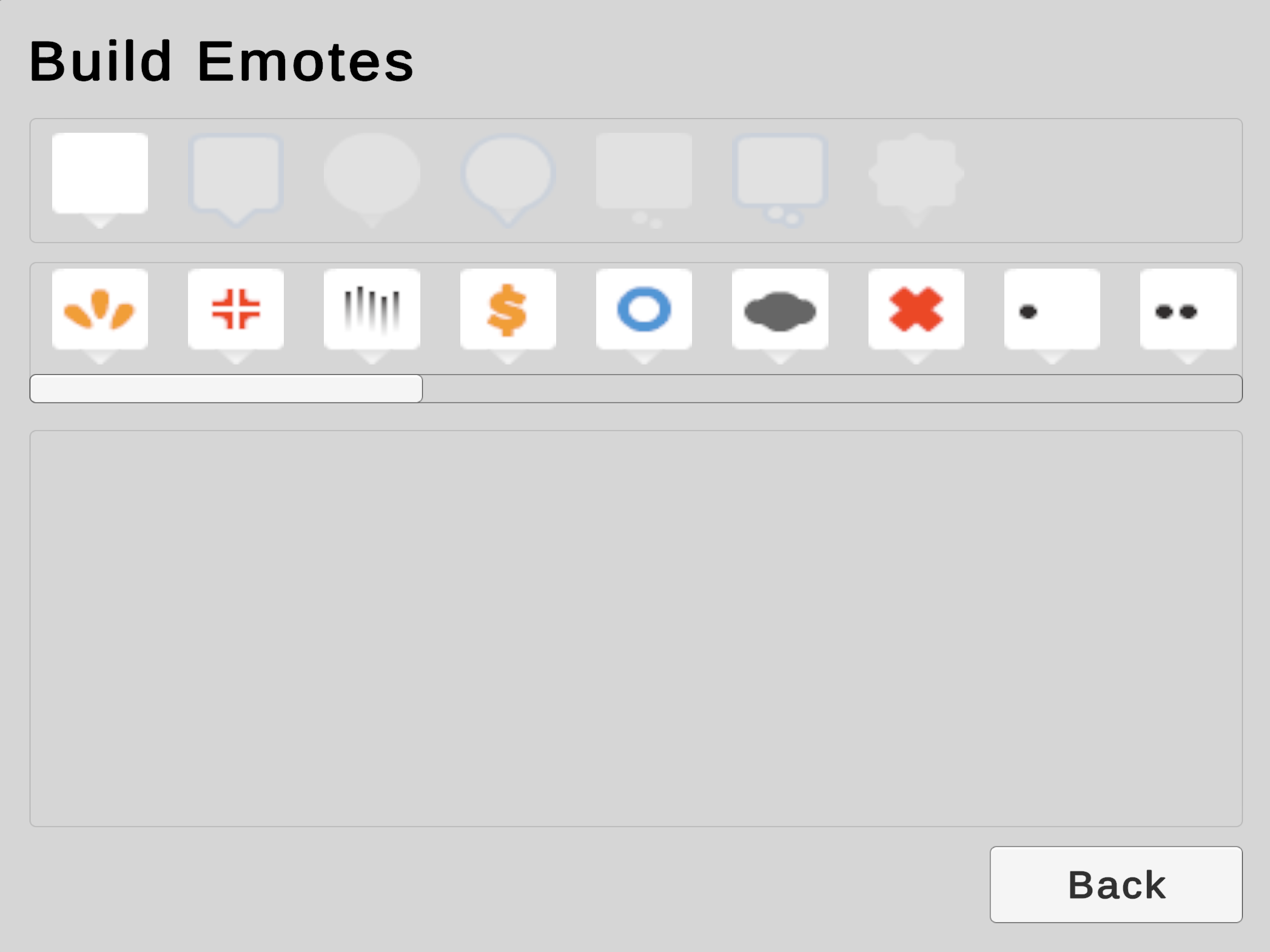
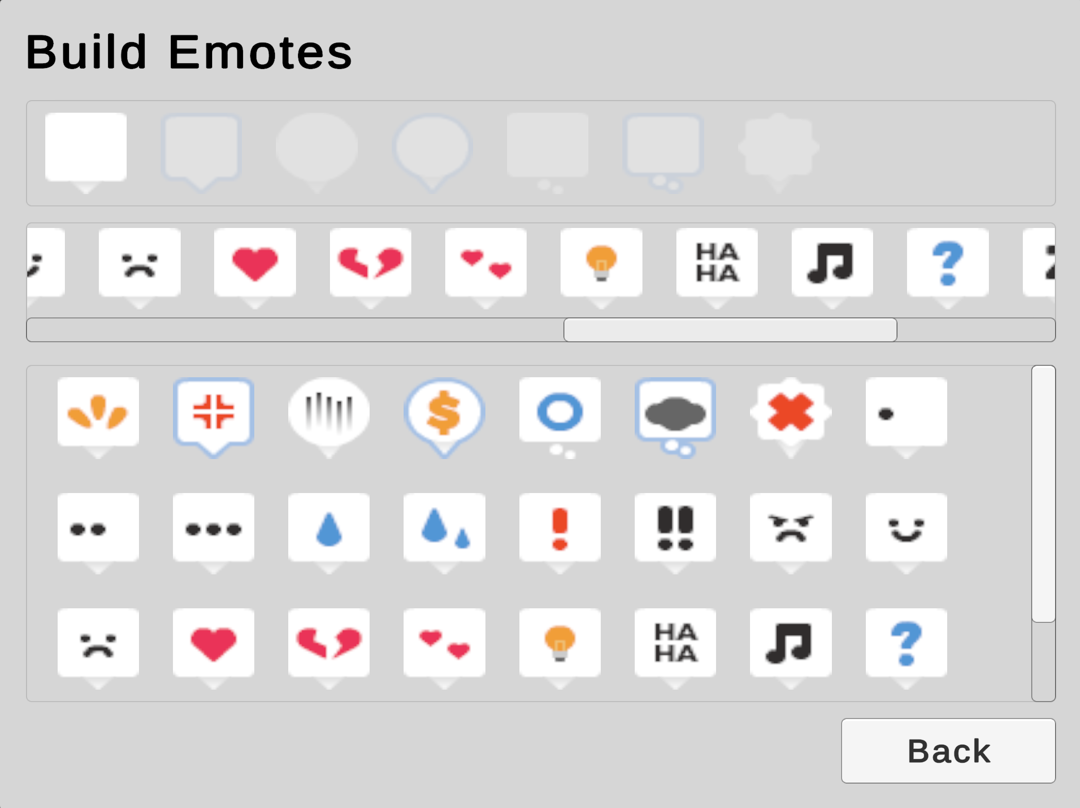
An additional area of focus for our user interface functionality is dynamic UI content. There are many circumstances where the amount of content is not known before execution, and so we must dynamically instantiate UI content at runtime. User-generated content (UGC) is a frequent source of UI volatility, and we will explore this by adding a menu that will let players build 2D visual emotes for their character.
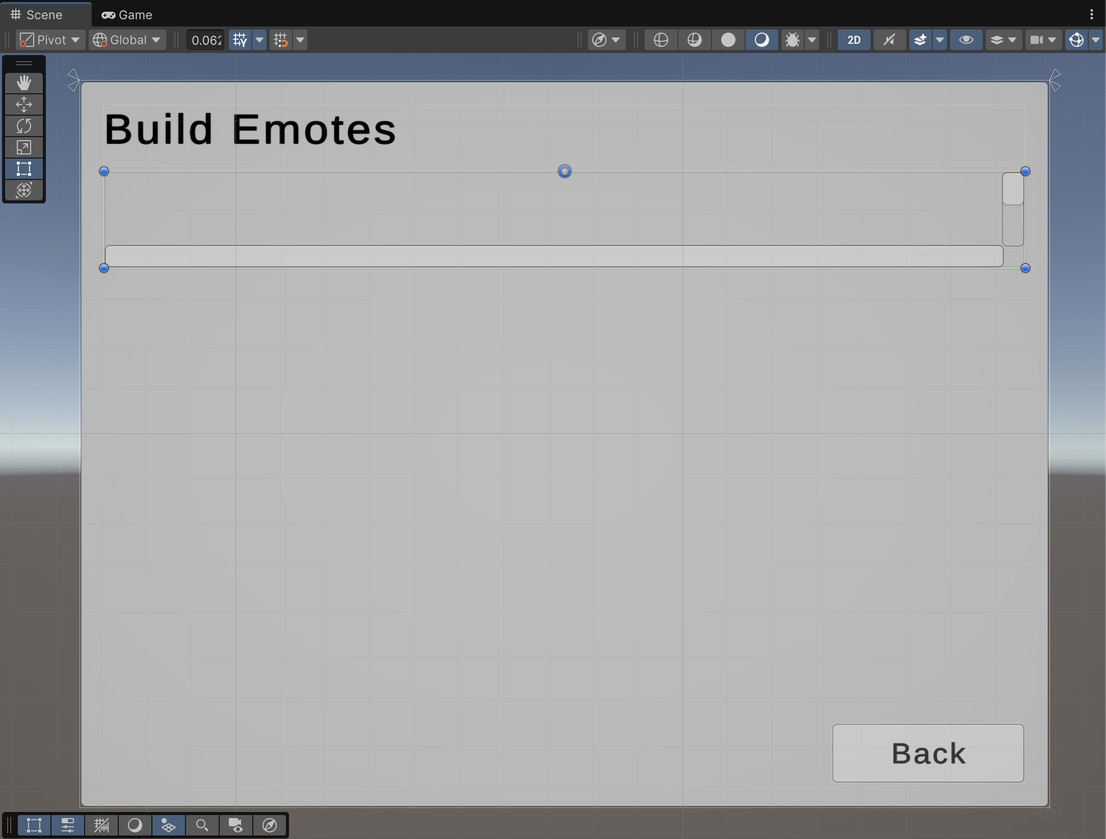
Our emotes menu will be a submenu. Players will be able to freely switch between the Character Creator screen and Emote Builder screen.
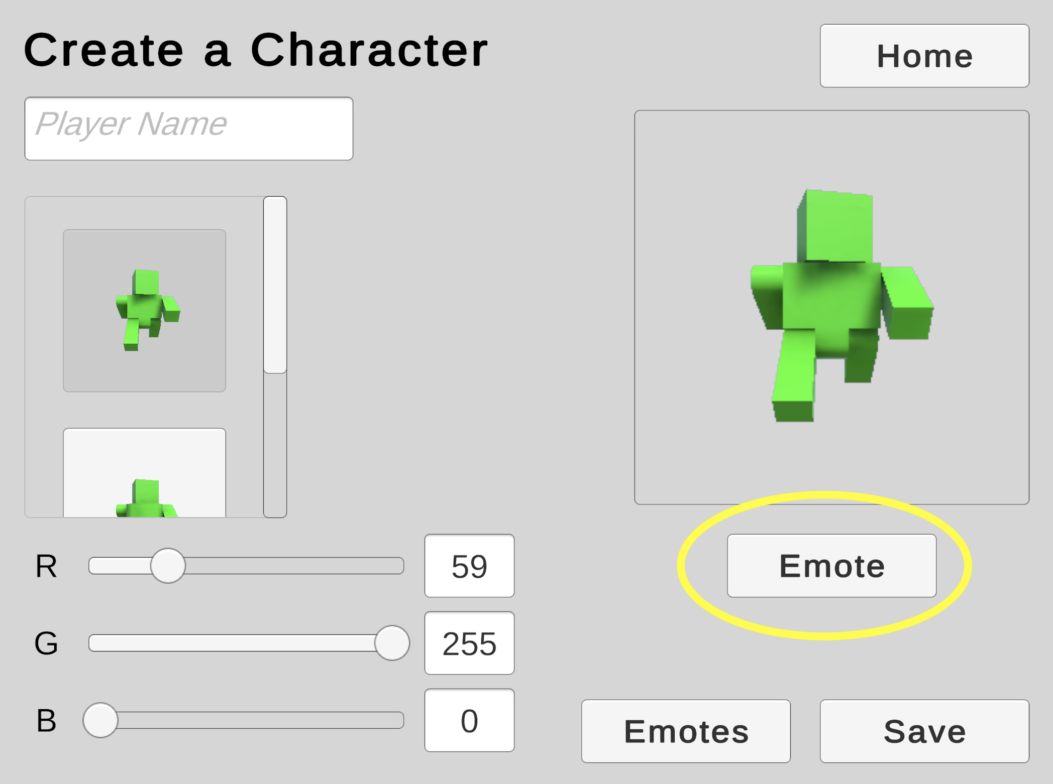
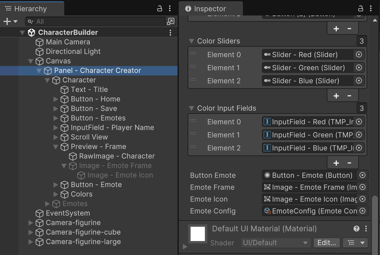
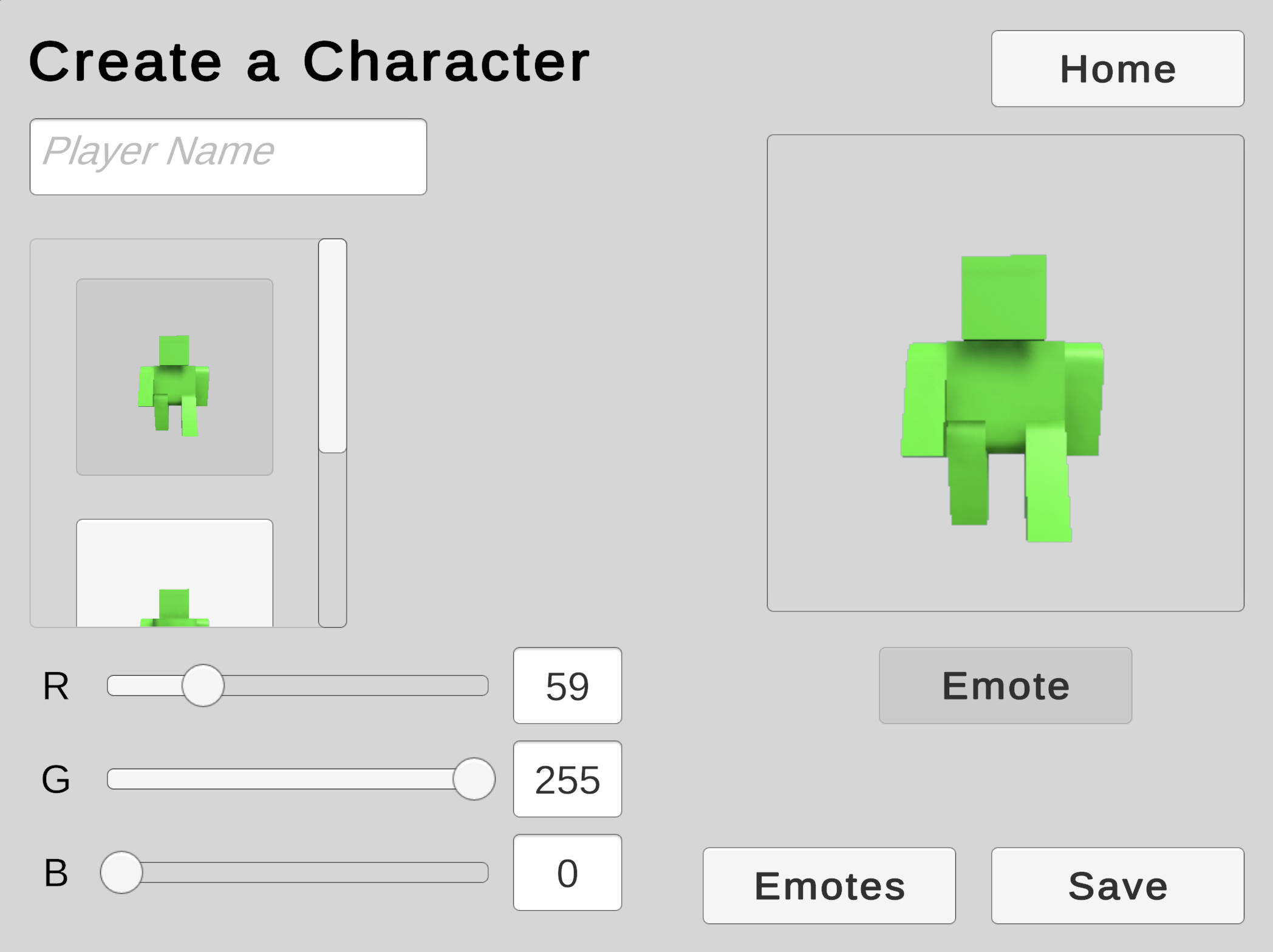
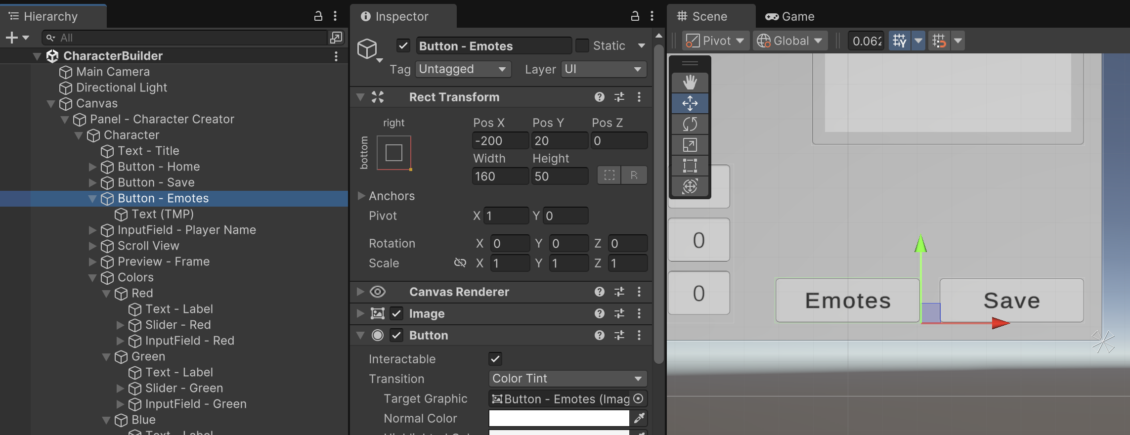
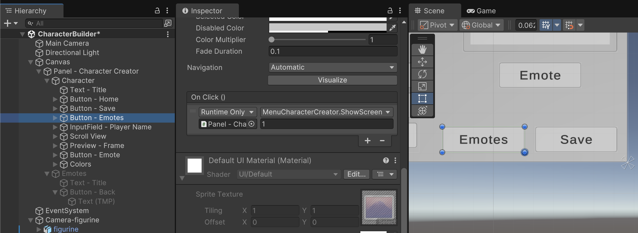
First, we'll add a couple buttons to the existing Character Creator screen. Add an "Emotes" button anchored bottom-right beside the Save button. This button will eventually switch to the new menu in an upcoming step.
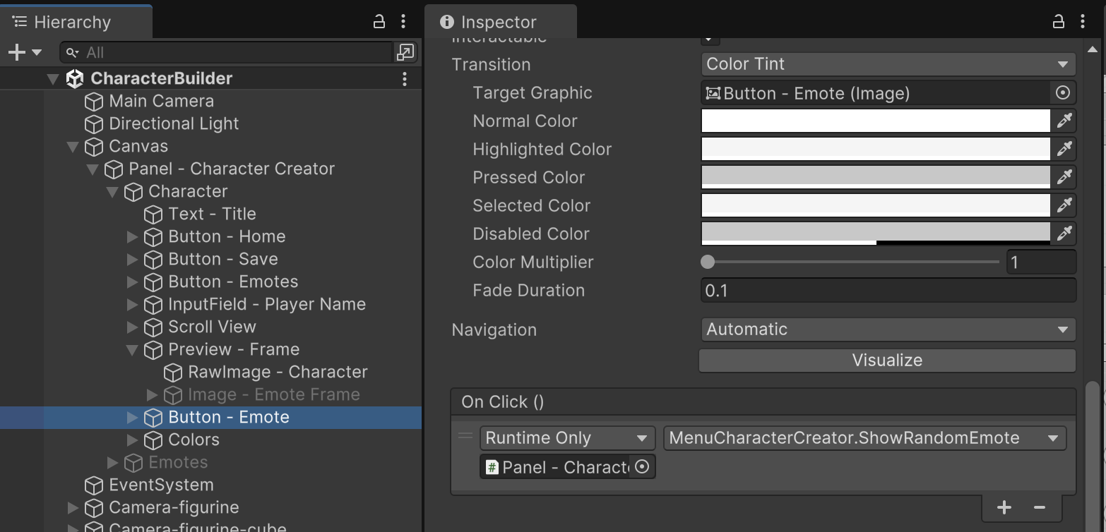
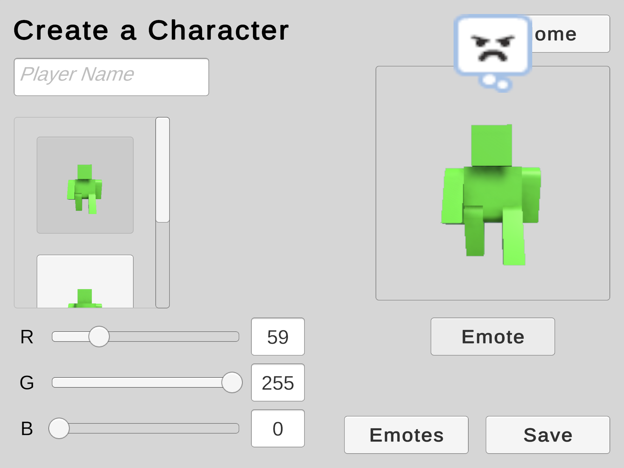
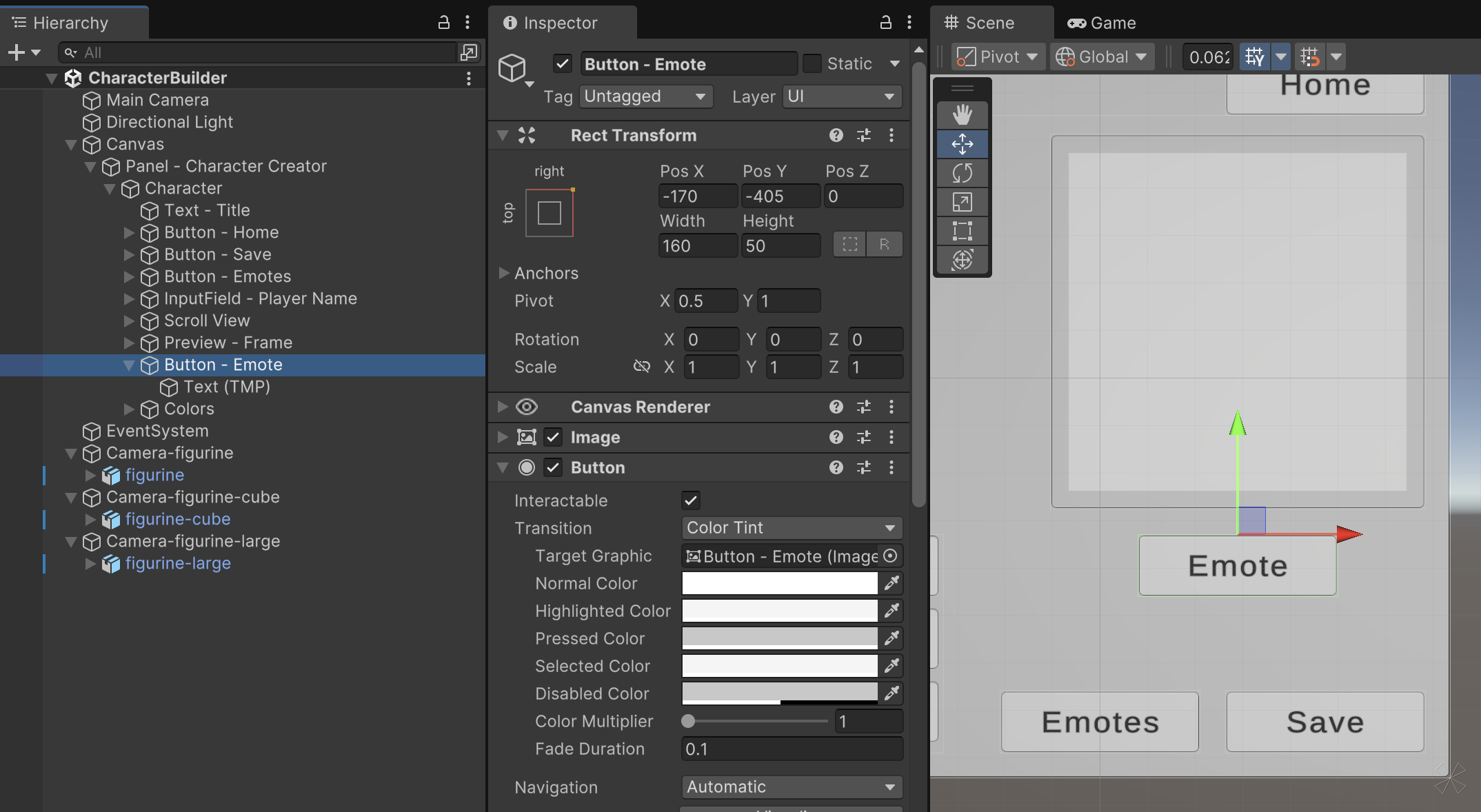
We'll also add an "Emote" button below the Character Preview. This button will display a random emote that the player has assigned to their character.
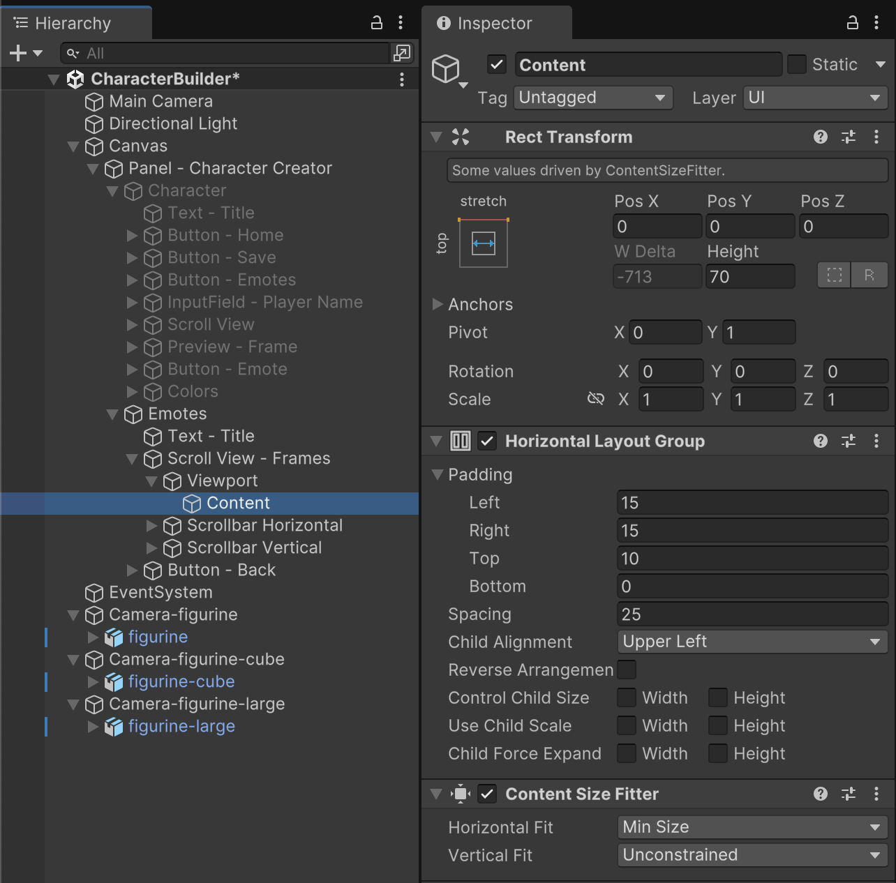
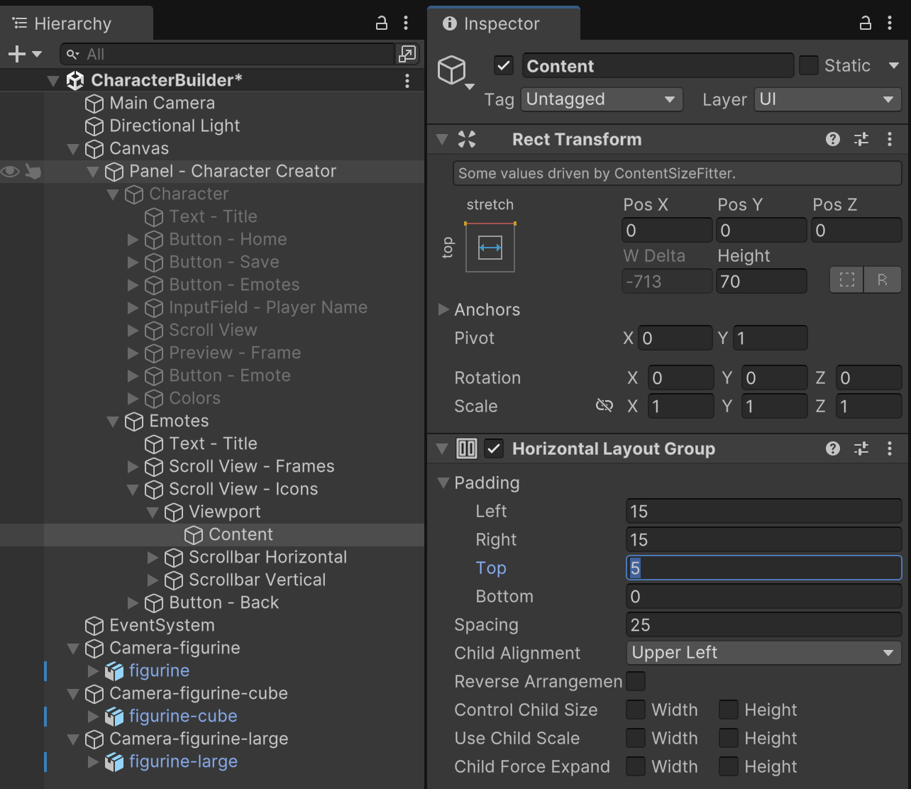
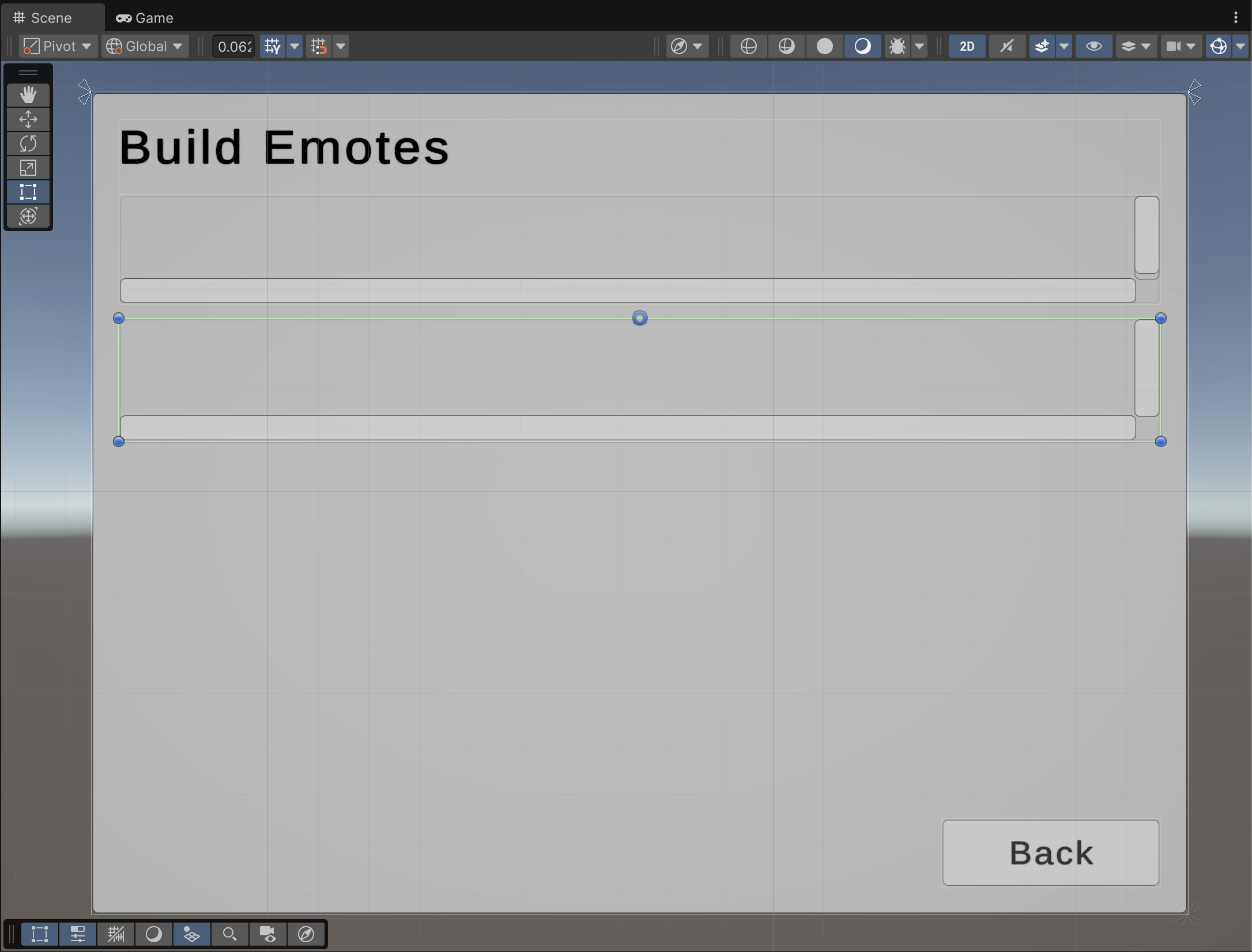
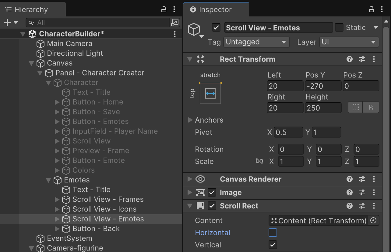
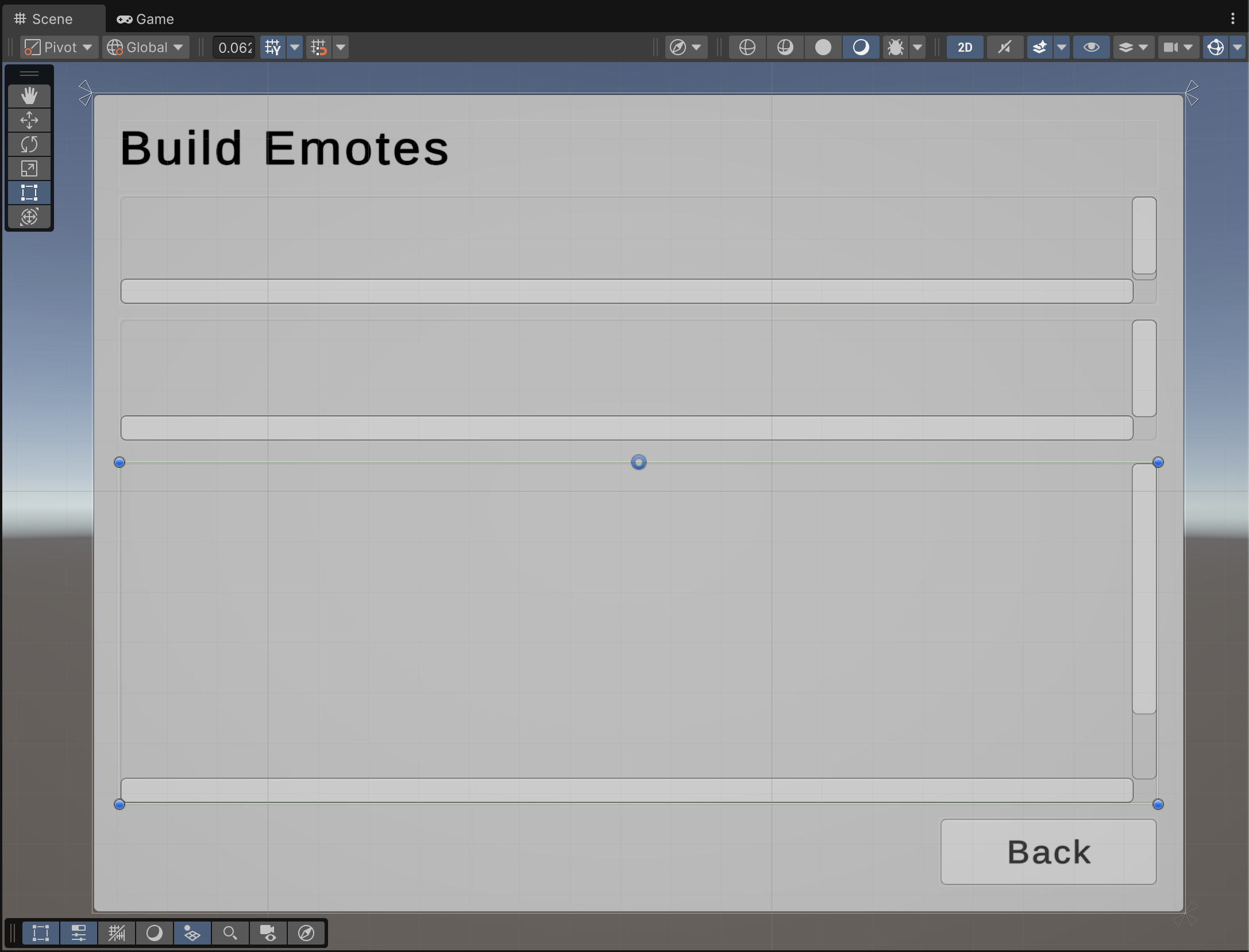
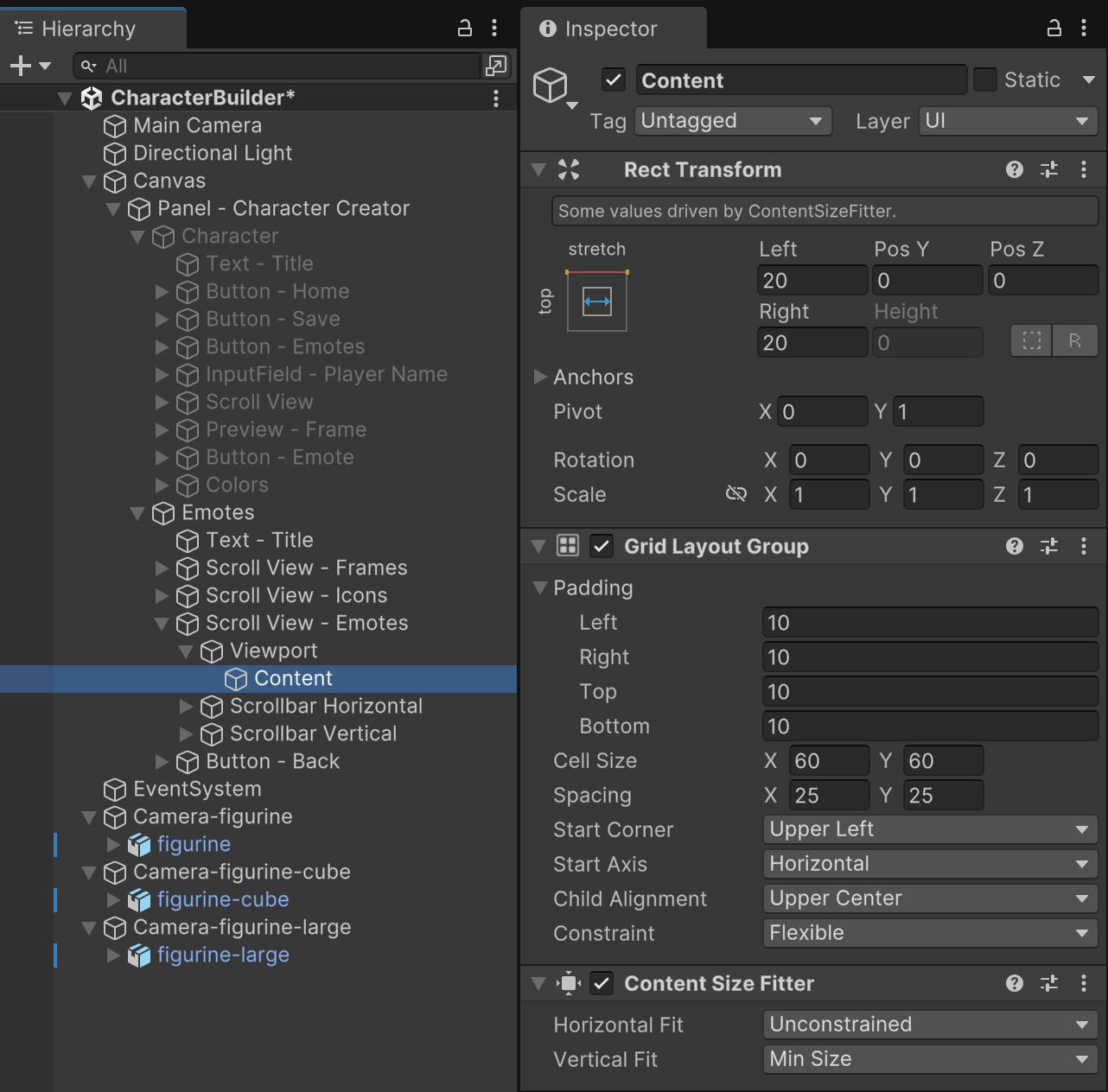
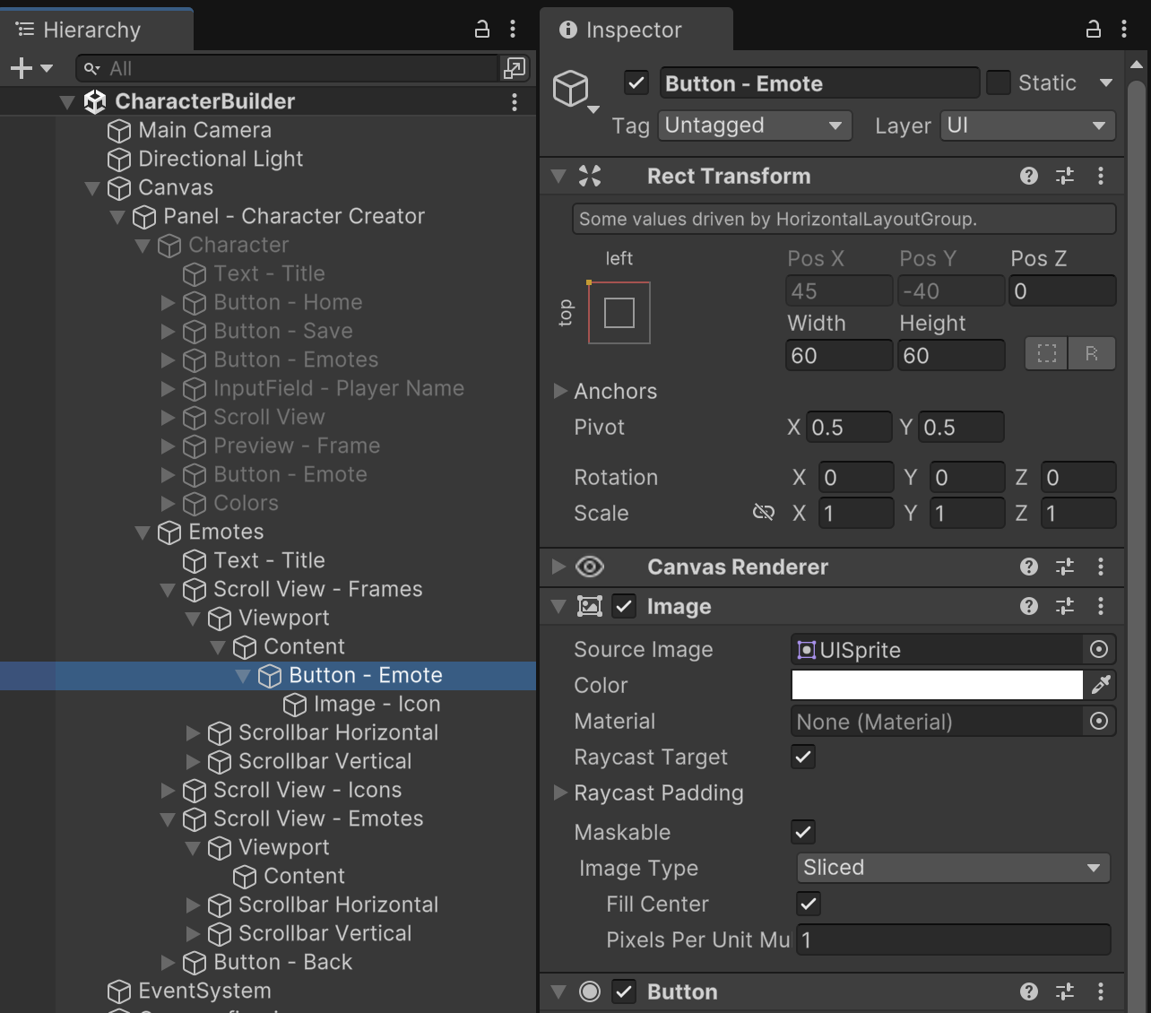
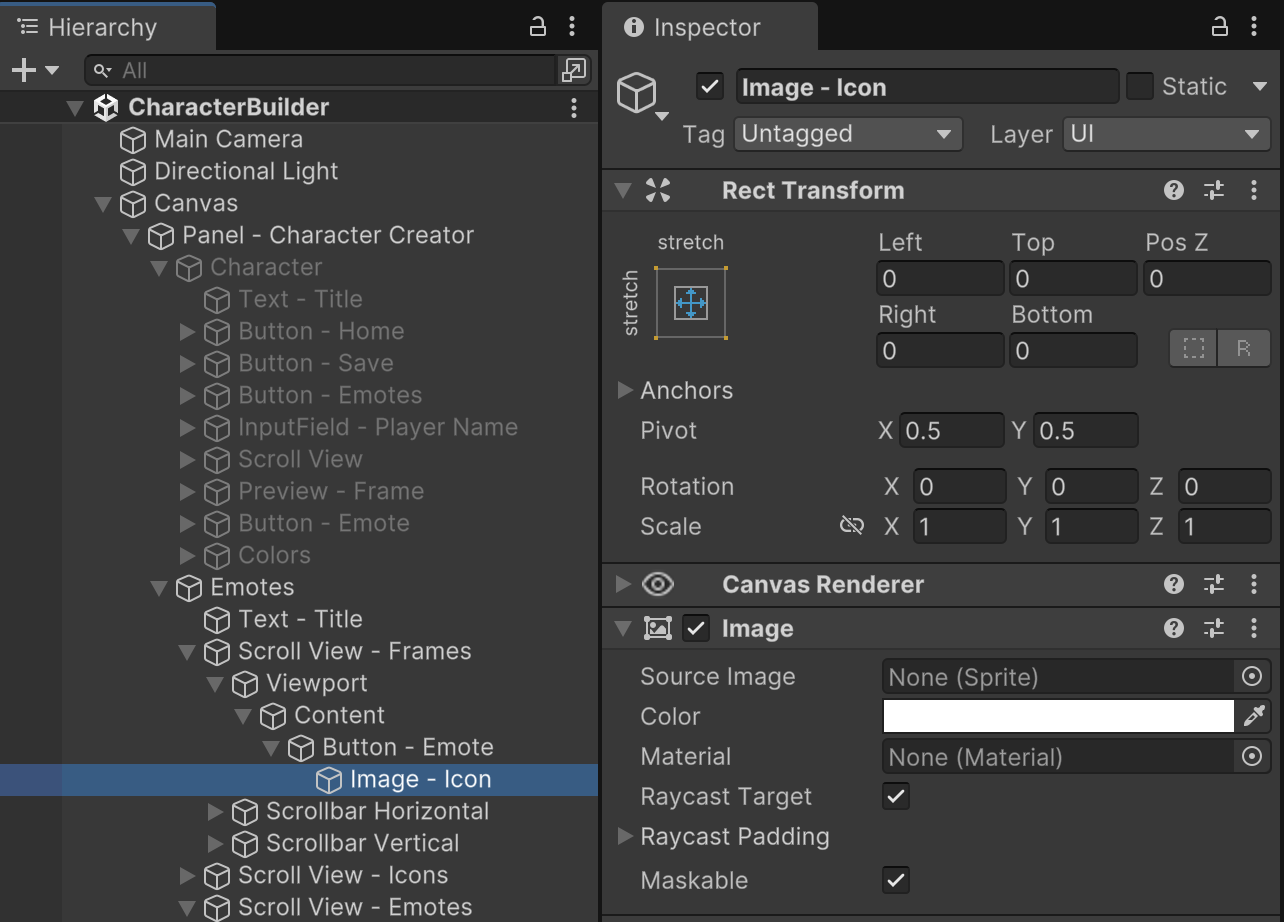
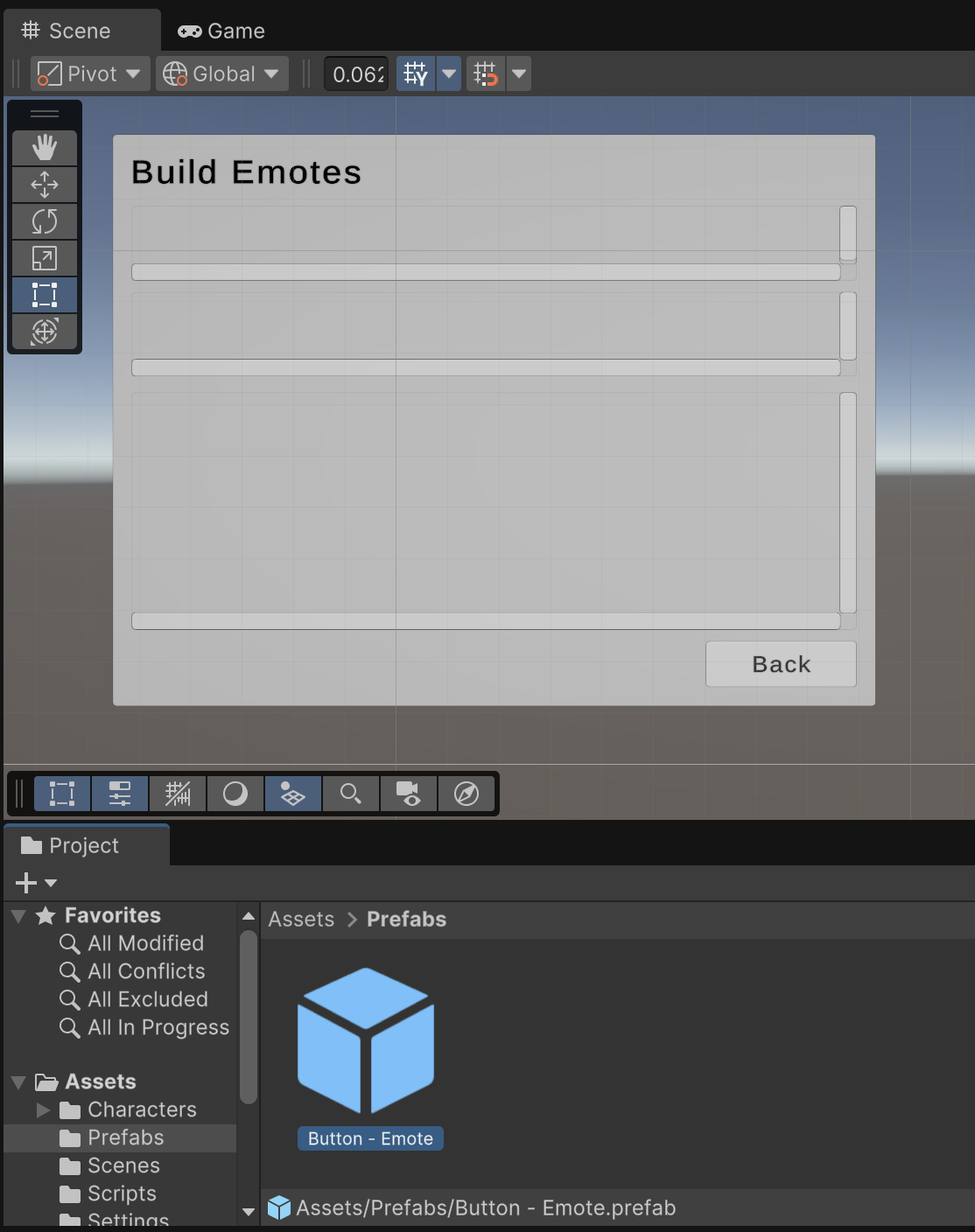
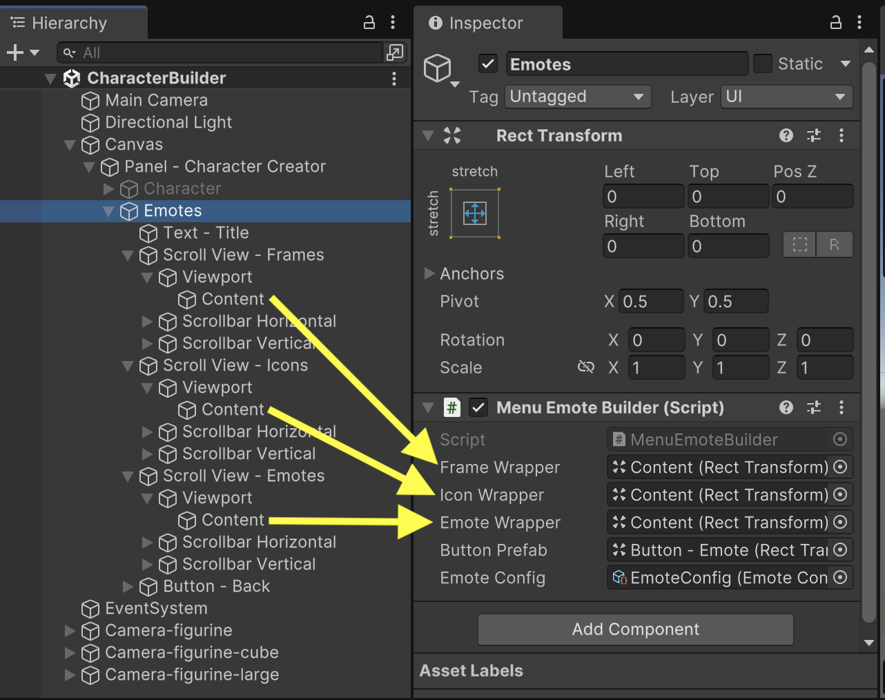
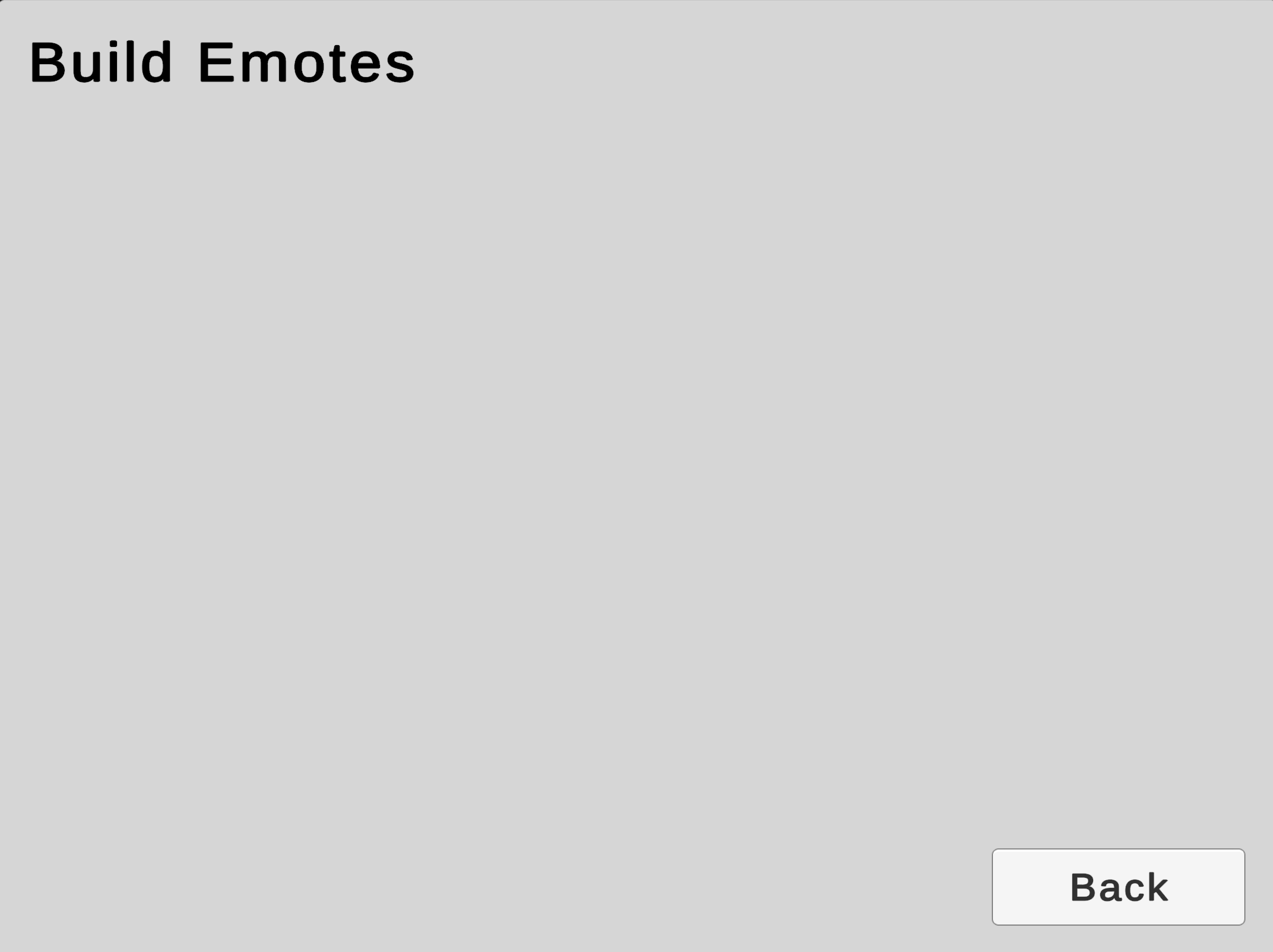
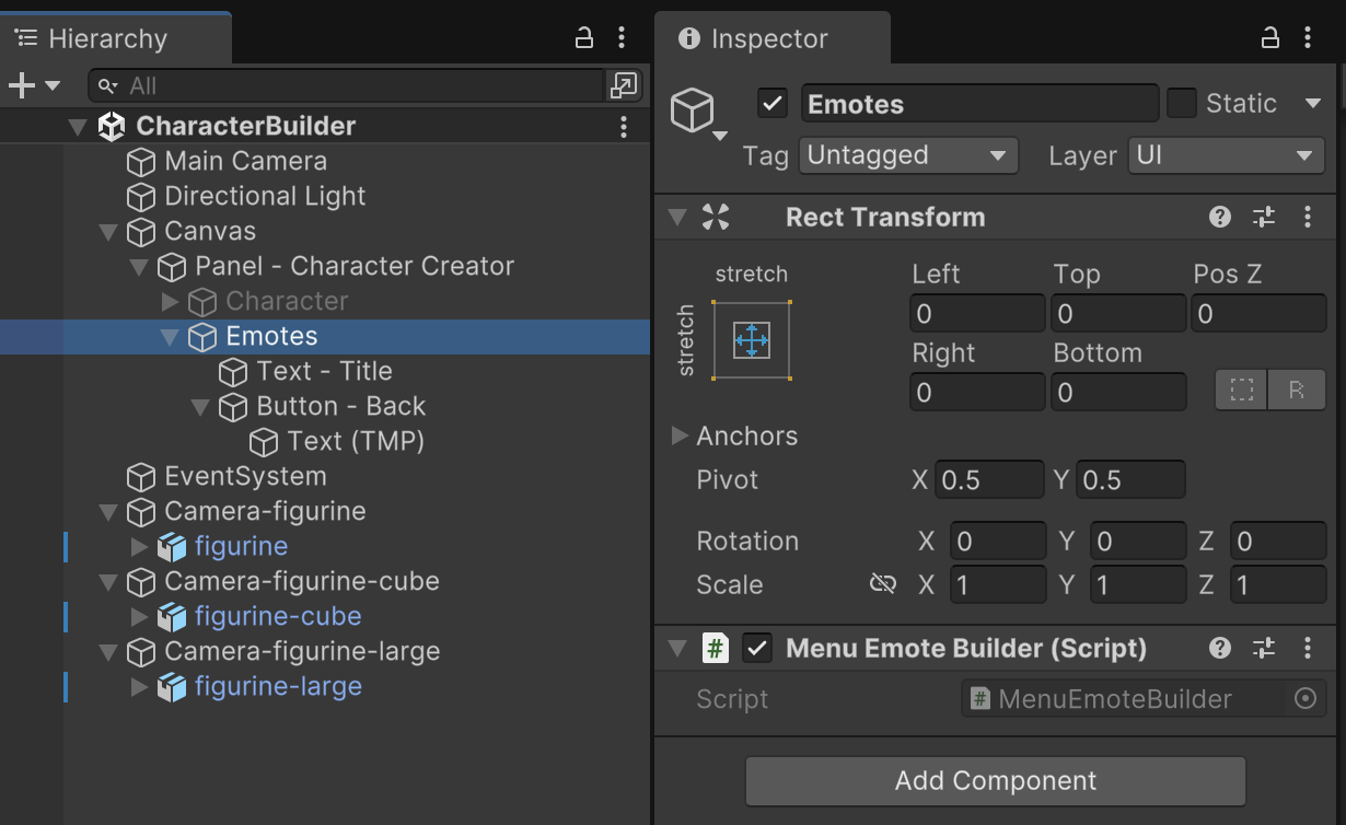
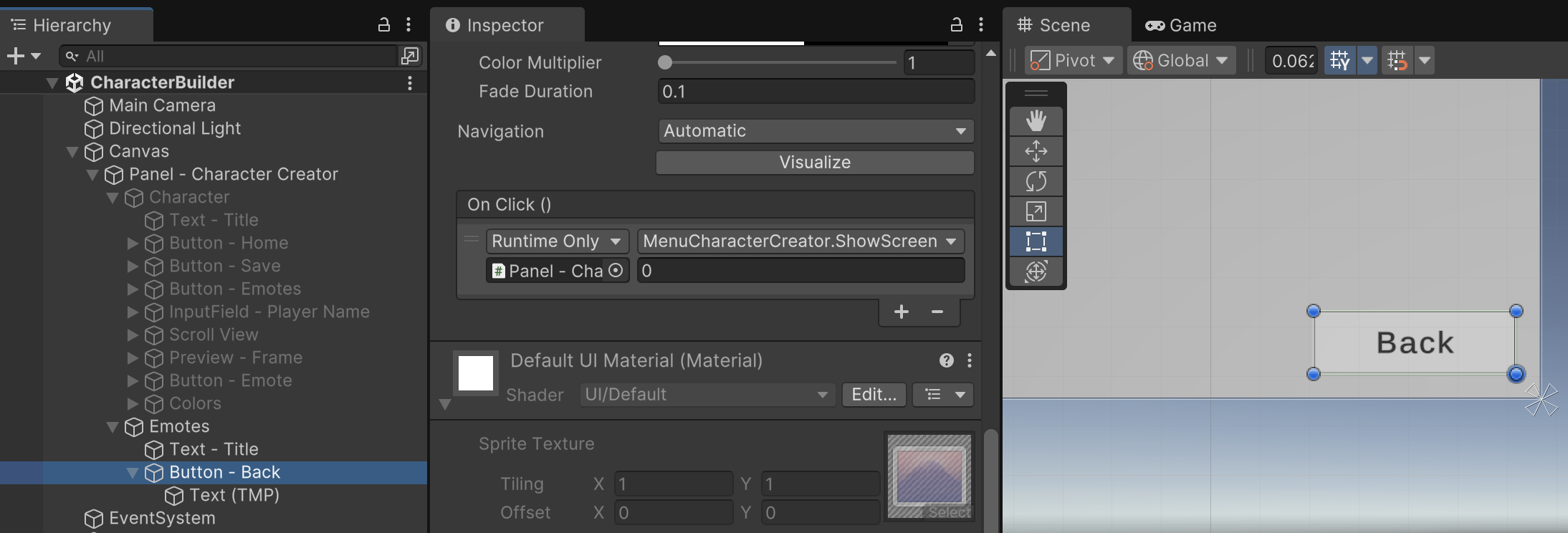
Create a new child object of "Panel - Character Creator" named "Emotes" using identical configuration to the existing "Character" submenu. The Emotes submenu will have an identical Title Text object and bottom-right Button, which you can clone from the Title Text and Save Button found in the "Characters" submenu. Copying objects in this fashion with identical settings helps maintain consistency throughout the UI.
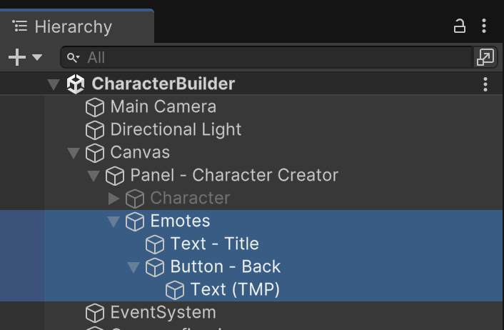
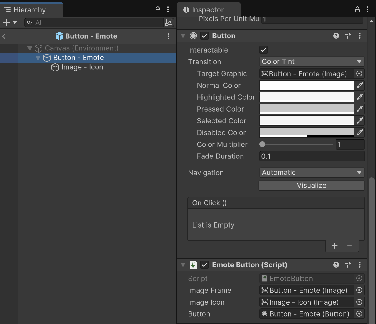
Start a new C# file named MenuEmoteBuilder and attach it to the new "Emotes" submenu object. (We'll work on this file's code in an upcoming step.)
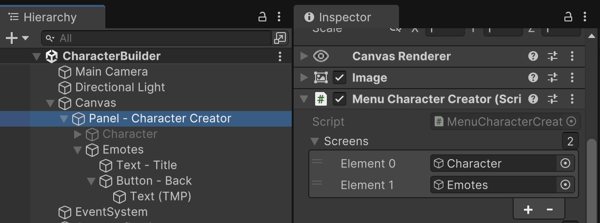
In our prior MenuCharacterCreator file, we will add an enum and an outlet property to keep track of and reference our screens. We'll add additional property for accessing our upcoming MenuEmoteBuilder
MenuCharacterCreator.cs
public class MenuCharacterCreator : MonoBehaviour { public enum Screen { Character = 0, Emotes = 1 } // Outlets public GameObject[] screens; MenuEmoteBuilder menuEmoteBuilder; public CharacterModel[] characters; public RenderTexture[] characterRenders; public RawImage characterImage; public Button[] characterButtons; public Slider[] colorSliders; public TMP_InputField[] colorInputFields; // State Tracking Color characterColor; // TEMPORARY. Will be replaced with save data. // Methods void Awake() { int emoteScreenIndex = (int)Screen.Emotes; if(screens.Length > emoteScreenIndex) { menuEmoteBuilder = screens[emoteScreenIndex].GetComponent<MenuEmoteBuilder>(); } }
Fill in the property for the screens. Be sure to match the index assignments defined by the Screen enum.
We'll add a couple functions for helping us switch between menus. The game will now also switch to the Character Creator screen by default at the start of execution.
MenuCharacterCreator.cs
void Start() { SwitchCharacter(0); // Read default character color if(characters.Length > 0) { // (All characters have the same color) characterColor = characters[0].GetColor(); } SetColorUI(characterColor); ShowScreen(Screen.Character); } public void ShowScreen(int index) { ShowScreen((Screen)index); } void ShowScreen(Screen screen) { int screenIndex = (int)screen; for(int i = 0; i < screens.Length; i++) { // Turn off all screens except the screen that matches our active screen index screens[i].SetActive(i == screenIndex); } }
Button click events cannot reference custom enums, which is why we have a version of the ShowScreen function that accepts an integer.
Hook up the click event for the Emotes Button to switch to screen index 1. Do not mix this up with the "Emote Button" (singular).
Hook up the click event for the Back Button to switch to screen index 0.
Testing the game at this point should reveal that the game always starts with the Character Creator screen, but you can freely switch back and forth between the Emote Builder and Character Screen screens using the UI buttons.
Earlier we imported a collection of Emote Icons and Emote Frames.
Players will be able to combine these to form emotes that their characters can display during gameplay.
The UI for the Emote Builder will require three Scroll Views.
Start by adding a new Scroll View named "Scroll View - Frames" as a child of the "Emotes" submenu. This Scroll View should stretch the width of the UI with 20 pixels of spacing on the left and right and 75 pixels of spacing down from the top. This Scroll View only scrolls horizontally.
The Content of this Scroll View should have a height of 70, a Horizontal Layout Group component, and a Content Size Fitter component to propertly display our emote frames.
The Scroll View for the Emote Icons will be very similar with only minor differences in sizing and position to accommodate content scrolling variations. Name this version "Scroll View - Icons".
The last Scroll View will be named "Scroll View - Emotes" and it differs in sizing and vertical scrolling.
Although the Emotes Scroll View scrolls vertically, it's Content will utilize a GridLayoutGroup component to make use of the more spacious viewing area. Notice how every component contributes an important detail to content sizing and positioning.
With the Scroll Views and Content areas prepared, the last step of UI prep will be the Emote Buttons. The number of buttons we need will differ based on the graphics available and the player's freedom to create emotes. Because we won't always know how many buttons will be in this UI, we'll need an Emote Button Prefab that we can duplicate as needed. Despite the variations in functionality among the Scroll Views, all three Scroll Views will use the same Emote Button Prefab.
Create a Button named "Button - Emote" as a child of the Scroll View "Content" gameObject. Give the button a size of 60 by 60. Replace the button's child Text with an Image named "Image - Icon" instead. Set the Image child to stretch to match the full size of the parent Button.
Convert "Button - Emote" into a Prefab and delete it from the Scene. The Scene should not start with any buttons already in the Emote Scroll Views because they will be generated programmatically in the next step.
Because we will be accessing Emote mechanics from multiple parts of our game, it would help to organize emote functionaity for easier access and reuse.
Scriptable Objects are a technique for saving and storing data during an Editor session and making that data available during Runtime Gameplay. There are memory optimization advantages to using Scriptable Objects, especially when the data is used across multiple objects. Scriptable Objects are prepared before execution and CANNOT be edited during gameplay.
The class definition for a scriptable object must match its filename. We will name ours, "EmoteConfig".
Create a new C# file called EmoteConfig. Using scriptable objects requires two steps. First, you write code that describes the object and adds it to the Asset Creation menu. Second, you create the object as a project asset and fill in any configuration values.
Notice how the class derives from ScriptableObject instead of MonoBehaviour. Scriptable objects cannot be attached to game objects the way a component would. The scriptable object class is preceded by an Attribute that allows you to configure how this scriptable object will appear in the asset creation menus.
EmoteConfig.cs
using UnityEngine; [CreateAssetMenu(fileName = "EmoteConfig", menuName = "Configuration/EmoteConfig")] public class EmoteConfig : ScriptableObject { public Sprite[] frames; public Sprite[] icons; }
The next step is to create the ScriptableObject asset. In the Project tab, add a subfolder named "Configuration". From the Project tab Create (+) menu, you should see a new category for "Configuration" which contains your "EmoteConfig" scriptable object.
Inspecting this new EmoteConfig asset reveals that you can configure it with all of the emote icons and emote frames you previously imported.
We'll also add a struct to the EmoteConfig C# file. The Emote struct will allow us to represent an Emote as a bundled frame and icon. Those frame and icon graphics will be tracked by index.
EmoteConfig.cs
using UnityEngine; [CreateAssetMenu(fileName = "EmoteConfig", menuName = "Configuration/EmoteConfig")] public class EmoteConfig : ScriptableObject { public Sprite[] frames; public Sprite[] icons; } public struct Emote { public int frameIndex; public int iconIndex; public Emote(int _frameIndex, int _iconIndex) { frameIndex = _frameIndex; iconIndex = _iconIndex; } }
We now have emote configuration and emote data objects available to build the rest of the menus.
All three scroll views will instantiate copies of the "Button - Emote" prefab we made in a prior step. As a reminder, you previously saved this prefab to "/Assets/Prefabs/Button - Emote.prefab"
There are four aspects of the button we want to configure:
Create a new C# file named EmoteButton. This first portion of code sets up the EmoteButton component and its outlet and configuration properties. The outlets allow us to control the sibling UI components. The callback will let us reference what function is triggered when the button is pressed. The emote property stores information describing what kind of emote this button represents.
EmoteButton.cs
using UnityEngine; using UnityEngine.UI; using UnityEngine.Events; public class EmoteButton : MonoBehaviour { // Outlets public Image imageFrame; public Image imageIcon; public Button button; // Configuration UnityAction<int> callback; public Emote emote; }
Continuing within the EmoteButton class, we'll add a couple functions that allow us to configure and use the properties we just made.
The Configure function accepts a couple graphics and appropriately hides the icon if it's unused (such as when this button is used in the Frames-only Scroll View). It also stores the callback function for later use. Our buttons have different functionality depending on which scroll view they are a part of, which means they require different callback functions.
The ButtonPressed function is automatically hooked up as the OnClick event for the button by the Configure function. When ButtonPressed is executed, it triggers whatever callback function was stored during the Configuration step. The callback function is given the index of the activated button, so we know what icon, frame, or emote the player is interacting with.
EmoteButton.cs
// Methods public void Configure(Sprite frame, Sprite icon, UnityAction<int> clickEvent) { if(frame) { imageFrame.sprite = frame; } if(icon) { imageIcon.sprite = icon; imageIcon.gameObject.SetActive(true); } else { imageIcon.gameObject.SetActive(false); } callback = clickEvent; button.onClick.AddListener(ButtonPressed); } void ButtonPressed() { int index = transform.GetSiblingIndex(); callback.Invoke(index); }
Attach the EmoteButton component to the prefab and hook up the outlets for the Images and Button properties. The "Image Frame" and "Button" properties refer to the same prefab object, while the "Image Icon" property should link to the child gameObject.
Save your prefab changes and return to the scene.
Open the MenuEmoteBuilder code file, which we previously attached to the "Emotes" submenu within the "Panel - Character Creator". First, we'll add the properties. MenuEmoteBuilder needs to be aware of the content holder objects for the three scroll views and the button prefab that will be used to fill them with content. We'll also hook up the EmoteConfig asset we previously created.
MenuEmoteBuilder.cs
using System.Collections.Generic; using UnityEngine; using UnityEngine.UI; public class MenuEmoteBuilder : MonoBehaviour { // Outlets public Transform frameWrapper; public Transform iconWrapper; public Transform emoteWrapper; public Transform buttonPrefab; // Configuration public EmoteConfig emoteConfig; // State Tracking int activeFrame; }
Buttons will have different functionality depending on their scroll view. It will be easier to understand what the different buttons do once we can see them on the screen. For now, we will create placeholder functions for these events within the MenuEmoteBuilder class. The FramePressed function will eventually contain the code for what happens when you click one of the Emote Frame buttons. Similarly, the IconPressed function will eventually have code for handling when you click the Emote Icon.
MenuEmoteBuilder.cs
public class MenuEmoteBuilder : MonoBehaviour { // Outlets public Transform frameWrapper; public Transform iconWrapper; public Transform emoteWrapper; public Transform buttonPrefab; // Configuration public EmoteConfig emoteConfig; // State Tracking int activeFrame; // Methods public void FramePressed(int index) { } public void IconPressed(int index) { } }
Having these placeholder functions will allow us to start creating buttons even though not all the functionality is ready yet. Create a Start function next to all the other methods. The Start function will loop through all the Emote Frames and Emote Icons in the EmoteConfig and add buttons to the scroll views representing each.
MenuEmoteBuilder.cs
// Methods void Start() { // Build the list of frame buttons for(int i = 0; i < emoteConfig.frames.Length; i++) { Sprite frame = emoteConfig.frames[i]; Transform button = Instantiate(buttonPrefab, frameWrapper.transform); EmoteButton emoteButton = button.GetComponent<EmoteButton>(); emoteButton.Configure(frame, null, FramePressed); } // Build the list of emote icon buttons for(int i = 0; i < emoteConfig.icons.Length; i++) { Sprite emote = emoteConfig.icons[i]; Transform button = Instantiate(buttonPrefab, iconWrapper.transform); EmoteButton emoteButton = button.GetComponent<EmoteButton>(); emoteButton.Configure(null, emote, IconPressed); } } public void FramePressed(int index) { }
Playing the game at this point and switching to the emotes menu reveals that the first two scroll views fill with content matching all of the frames and icons available. Clicking the buttons doesn't do anything yet.
Tapping buttons in the top Emote Frames scroll view will let players activate one of the frames as the background choice for the emote they are building. (Emotes consist of a background frame and a foreground icon.)
When a frame is activated, that choice should be highlighted among the other frames, and all other emote icon previews in the second scroll view should show that frame too. This can be achieved by finishing the code within the FramePressed function we previously left as a placeholder.
MenuEmoteBuilder.cs
public void FramePressed(int index) { activeFrame = index; // Dim all other frame buttons for(int i = 0; i < frameWrapper.transform.childCount; i++) { Transform child = frameWrapper.GetChild(i); Image buttonImage = child.GetComponent<Image>(); // Highlight the selected button if(i == index) { buttonImage.color = Color.white; } else { buttonImage.color = new Color(1f, 1f, 1f, 0.25f); } } // Update previews for emote icons for(int i = 0; i < iconWrapper.transform.childCount; i++) { Transform child = iconWrapper.GetChild(i); Image buttonImage = child.GetComponent<Image>(); buttonImage.sprite = emoteConfig.frames[activeFrame]; } }
Testing the game should reveal that clicking any of the Emote Frame buttons highlights the active frame and updates all of the Emote Icon buttons to match.
An important nuance for the user experience (UX) would be to automatically select the first frame by default to properly reflect the initial state of the UI.
MenuEmoteBuilder.cs
// Methods void Start() { // Build the list of frame buttons for(int i = 0; i < emoteConfig.frames.Length; i++) { Sprite frame = emoteConfig.frames[i]; Transform button = Instantiate(buttonPrefab, frameWrapper.transform); EmoteButton emoteButton = button.GetComponent<EmoteButton>(); emoteButton.Configure(frame, null, FramePressed); } // Build the list of emote icon buttons for(int i = 0; i < emoteConfig.icons.Length; i++) { Sprite emote = emoteConfig.icons[i]; Transform button = Instantiate(buttonPrefab, iconWrapper.transform); EmoteButton emoteButton = button.GetComponent<EmoteButton>(); emoteButton.Configure(null, emote, IconPressed); } // Select the first frame by default if(frameWrapper.childCount > 0) { frameWrapper.GetChild(0).GetComponent<Button>().onClick.Invoke(); } }
Clicking any of the buttons in the second scroll view of Emote Icons will populate the third scroll view with finalized Emote Buttons. The finalized emote will reflect both the active Emote Frame and the particular Emote Icon that was clicked.
We achieve this by finishing the IconPressed function we previously left as a placeholder. To help make our code more flexible for future savedata, we'll have a separate CreateEmoteButton function. Organizing the code in this fashion suggests that in addition to pressing the emote icon (IconPressed), there are other events that might cause us to use CreateEmoteButton to add emotes to our list. We'll learn later that this other event will happen when we need to restore previous emotes from save data.
CreateEmoteButton retrieves emote icon and emote frame graphics from the emoteConfig based on index. Emote data is also stored in the button based on the indexes.
A third function, EmotePressed, is assigned to the newly created Emote Button as a callback function. Clicking emote buttons in our inventory removes them from our collection.
MenuEmoteBuilder.cs
public void IconPressed(int index) { CreateEmoteButton(activeFrame, index); } public void CreateEmoteButton(int frameIndex, int iconIndex) { Sprite frame = emoteConfig.frames[frameIndex]; Sprite emote = emoteConfig.icons[iconIndex]; Transform button = Instantiate(buttonPrefab, emoteWrapper.transform); EmoteButton emoteButton = button.GetComponent<EmoteButton>(); emoteButton.Configure(frame, emote, EmotePressed); emoteButton.emote = new Emote(frameIndex, iconIndex); } public void EmotePressed(int index) { Transform child = emoteWrapper.GetChild(index); Destroy(child.gameObject); }
Testing this latest code should allow you to create a variety of emote designs and also remove designs from your list that you don't want to keep.
Our first use of our emote designs is to have them pop up above our character when the player pushes a button. Last time we worked on the Character menu, there was an Emote button that was missing functionality.
To show these emotes, we'll create an emote frame image as a child of the character's "Preview - Frame". Position it as shown and create another child image to show the emote icon. The emote icon expands to the size of the emote frame. These images will be chosen programmatically, so for now you can pick any of the frames and icons to preview your UI.
If you get the bug where the Emote Preview shows behind other content such as the Home button, just move "Button - Home" higher in the hiearachy. UI that is lower in the hiearchy list renders on top of other UI content.
Deactivate the emote preview by default. We'll only show the UI when the player clicks the Emote button.
Back in MenuEmoteBuilder, we'll add a GetEmotes function that we can use to share our emotes list with other menus.
MenuEmoteBuilder.cs
public void EmotePressed(int index) { Transform child = emoteWrapper.GetChild(index); Destroy(child.gameObject); } public List<Emote> GetEmotes() { List<Emote> emotes = new List<Emote>(); for(int i = 0; i < emoteWrapper.childCount; i++) { Transform child = emoteWrapper.GetChild(i); EmoteButton emoteButton = child.GetComponent<EmoteButton>(); emotes.Add(emoteButton.emote); } return emotes; } }
Revisiting MenuCharacterCreator, we need new "using" statements and new outlet properties to control the emote button and emote preview images we just made.
MenuCharacterCreator.cs
using System.Collections; using System.Collections.Generic; using UnityEngine; using UnityEngine.UI; using TMPro; public class MenuCharacterCreator : MonoBehaviour { public enum Screen { Character = 0, Emotes = 1 } // Outlets public GameObject[] screens; MenuEmoteBuilder menuEmoteBuilder; public CharacterModel[] characters; public RenderTexture[] characterRenders; public RawImage characterImage; public Button[] characterButtons; public Slider[] colorSliders; public TMP_InputField[] colorInputFields; public Button buttonEmote; public Image emoteFrame; public Image emoteIcon; // Configuration public EmoteConfig emoteConfig;
We want to enable the Emote button only if the player has already made some emotes to display. We previously wrote a ShowScreen function, and we can enhance this to check on our available emotes whenever we show the Character screen.
MenuCharacterCreator.cs
void ShowScreen(Screen screen) { int screenIndex = (int)screen; for(int i = 0; i < screens.Length; i++) { // Turn off all screens except the screen that matches our active screen index screens[i].SetActive(i == screenIndex); // Activate the Character Emote button only if some emotes are available if(screen == Screen.Character) { List<Emote> emotes = menuEmoteBuilder.GetEmotes(); buttonEmote.interactable = emotes.Count > 0; } } }
Testing the game should reveal that the Emote button is deactivated until the player goes to the emotes menu to build some emotes.
Finally, we'll add a ShowRandomEmote function and a ShowEmoteTimer coroutine to MenuCharacterCreator. We Stop and Start the coroutine to clear out any old coroutine timers on every button press just in case the player repeatedly mashes the emote button before a prior coroutine finishes. If we don't reset the coroutine in this manner, it's possible the timer from emote button press #3 might hide the preview from button press #5, for example.
MenuCharacterCreator.cs
public void ChangeColorTextBlue(string value) { ChangeColorBlue(ConvertToColor255(value)); } public void ShowRandomEmote() { List<Emote> emotes = menuEmoteBuilder.GetEmotes(); Emote randomEmote = emotes[Random.Range(0, emotes.Count)]; emoteFrame.sprite = emoteConfig.frames[randomEmote.frameIndex]; emoteIcon.sprite = emoteConfig.icons[randomEmote.iconIndex]; StopCoroutine("ShowEmoteTimer"); StartCoroutine("ShowEmoteTimer"); } IEnumerator ShowEmoteTimer() { emoteFrame.gameObject.SetActive(true); yield return new WaitForSeconds(0.5f); emoteFrame.gameObject.SetActive(false); } }
Assign ShowRandomEmote as the click event for the Emote button.
Try pressing the Emote button several times to see it randomly display emotes from your collection.
Play your scene and ensure that all your features and interactions perform as demonstrated throughout the tutorial.
SAVE any open files or scenes and close Unity to ensure any temp files are finalized.
Submit your assignment for grading following the instructions supplied for your particular classroom.