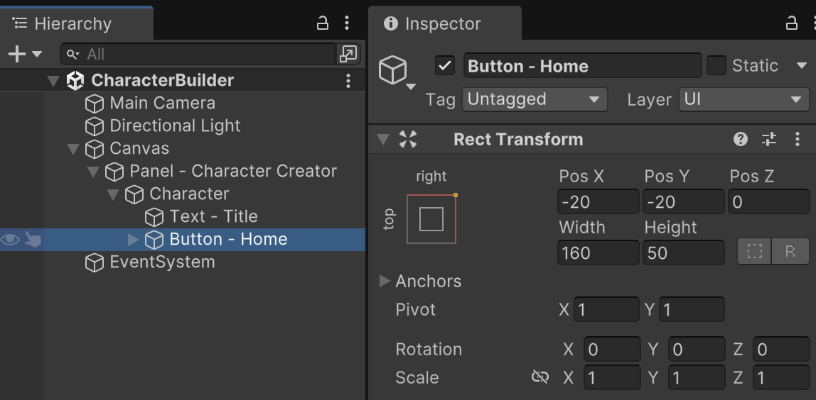
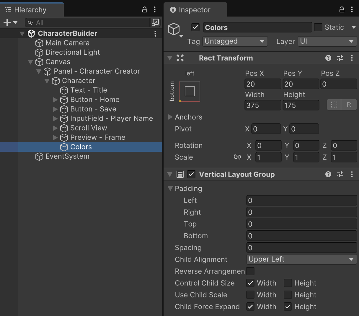
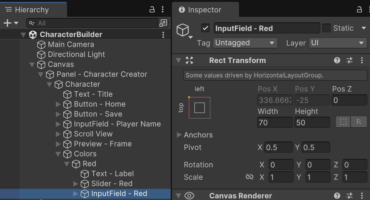
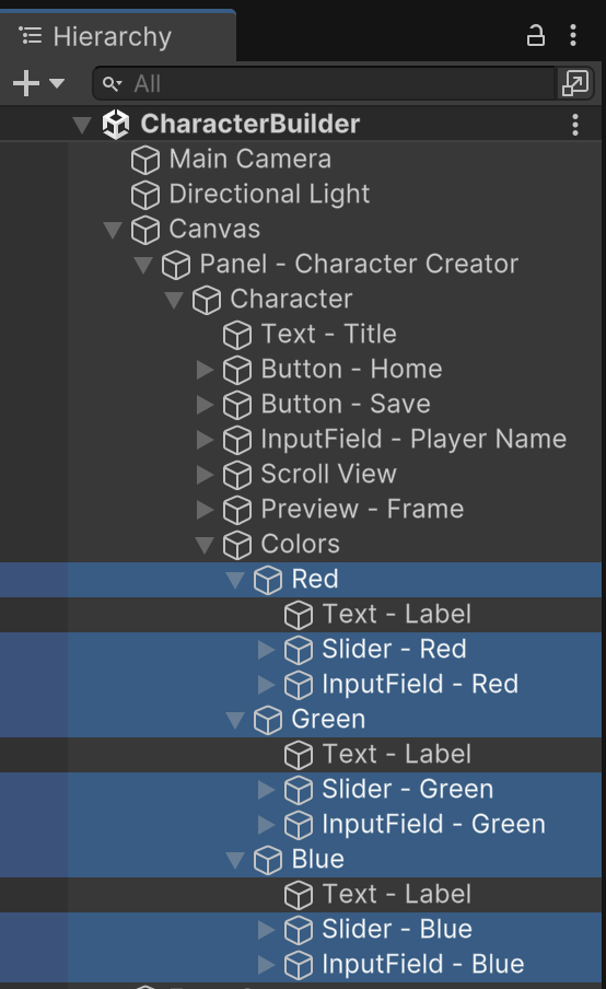
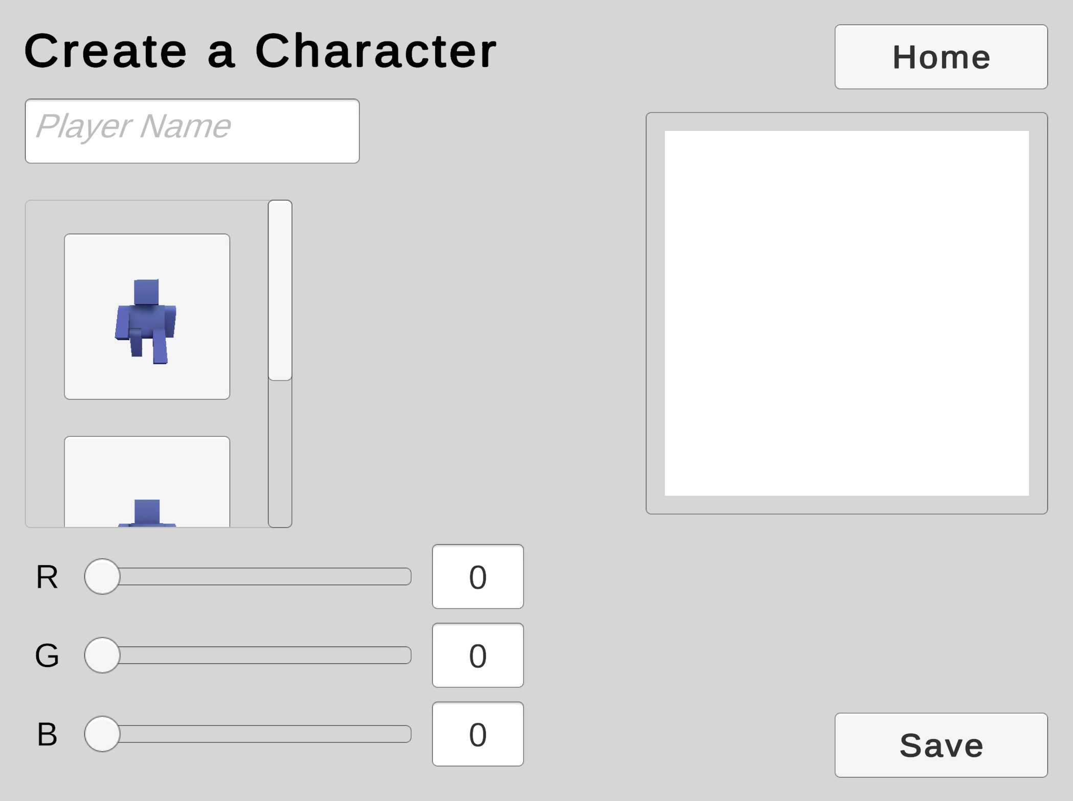
Code Color Sliders
The default texturing on these models does not make it easy for us to customize the coloring. To fix this, we will create and assign our own material that we can tint using the RGB sliders in our UI.
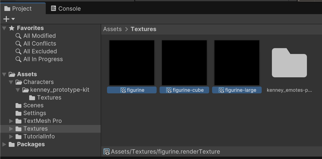
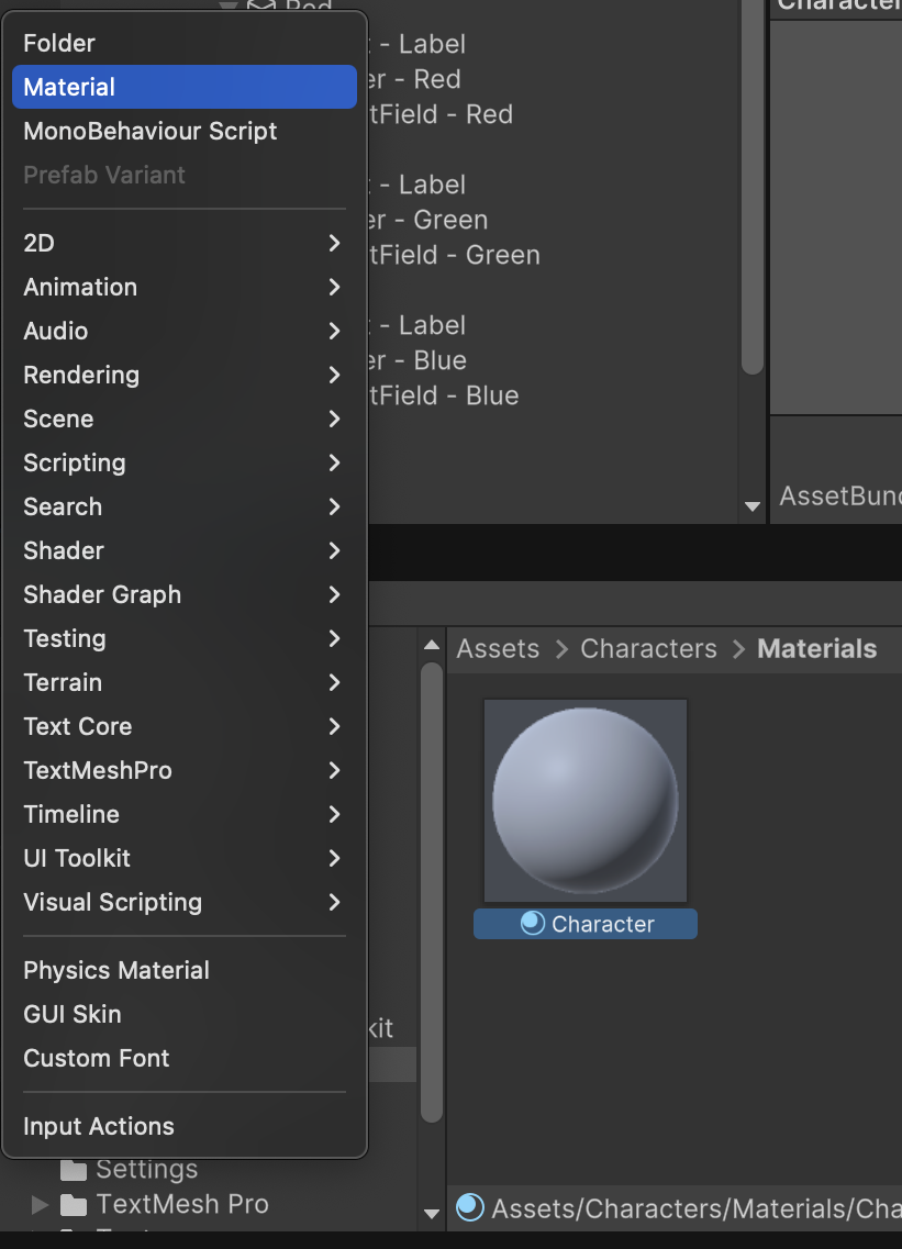
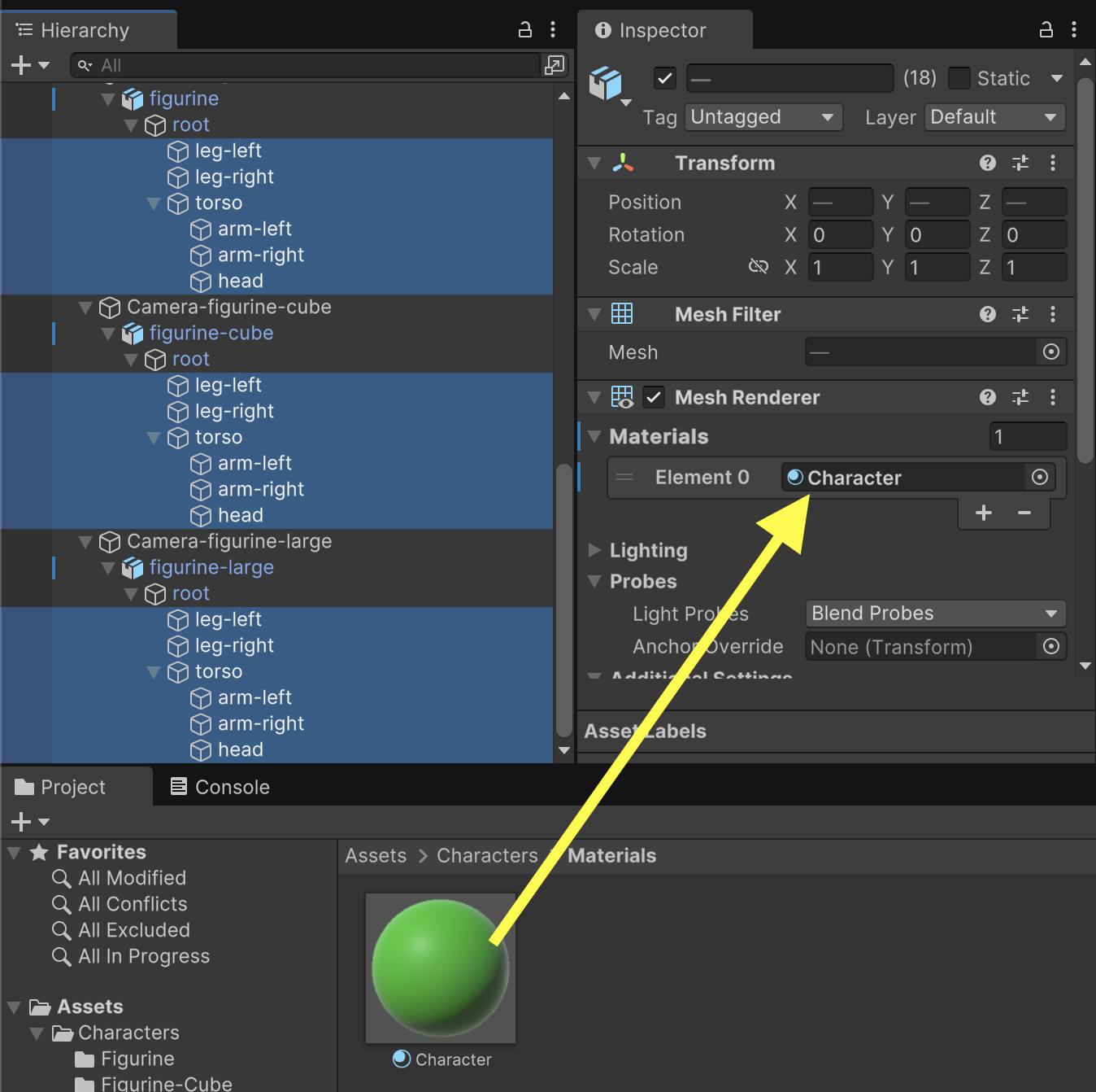
In the Project tab, create a "Materials" subfolder under /Assets/Characters/ and in that subfolder, create a Material named Character.
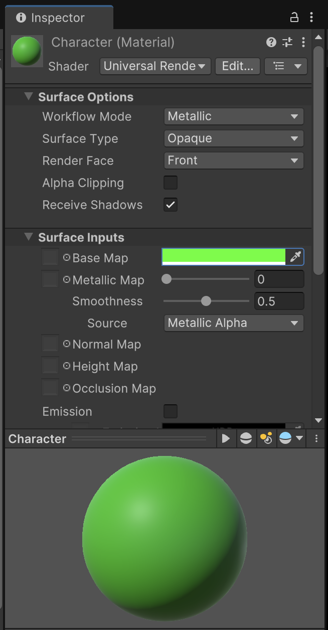
Inspect the Character material and change it's Base Map tint to a different default color such as green. (The player will have the freedom to customize their own RGB values later through the game UI.)
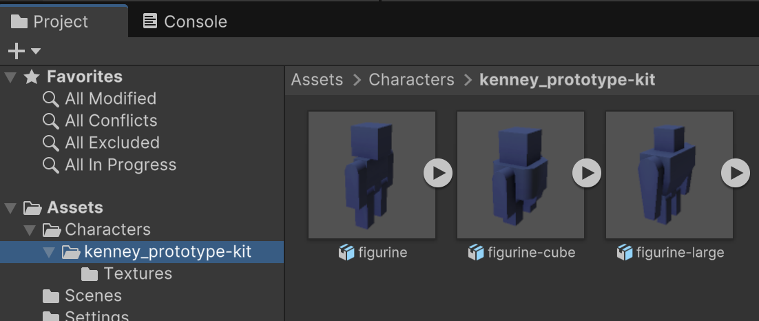
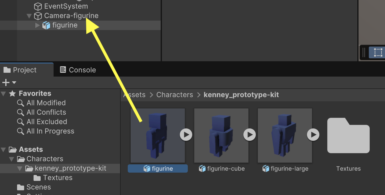
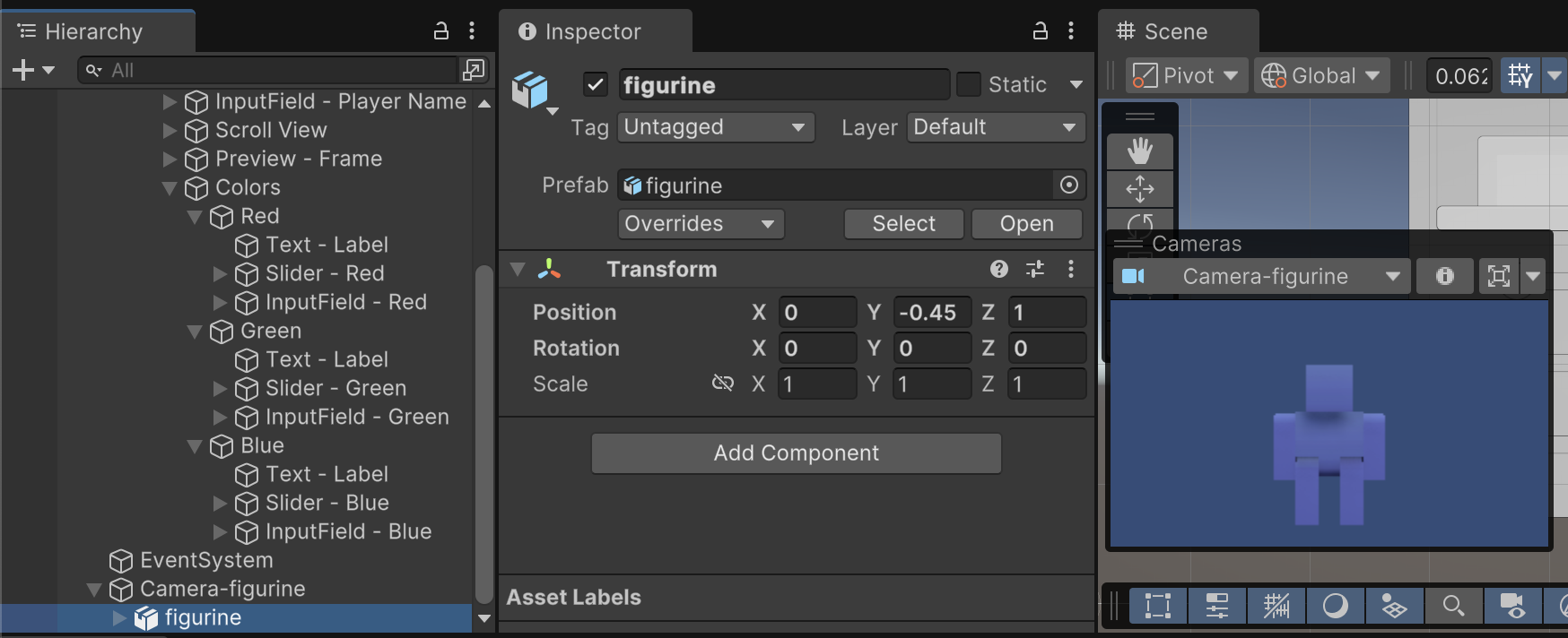
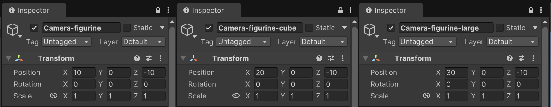
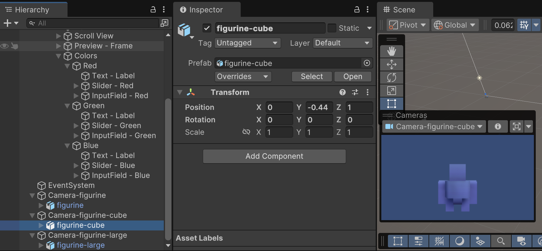
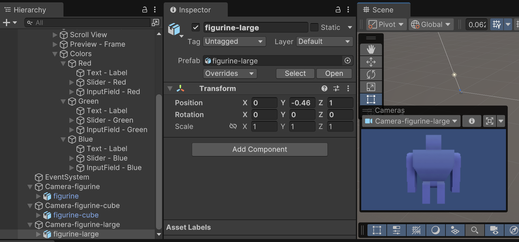
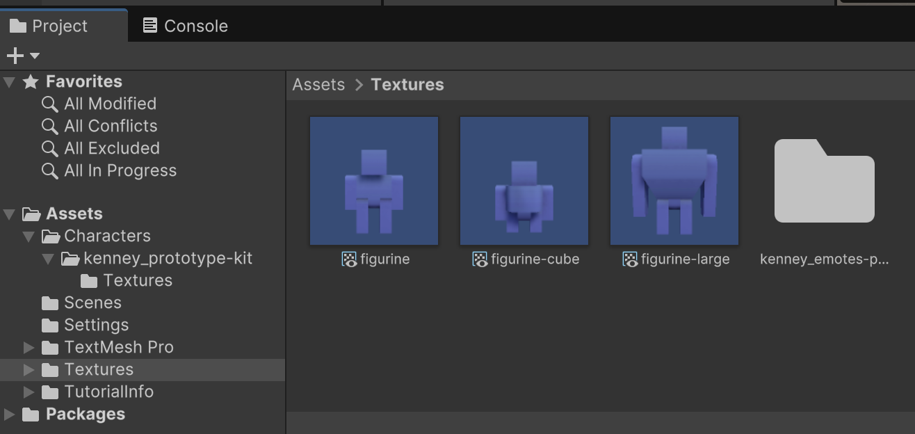
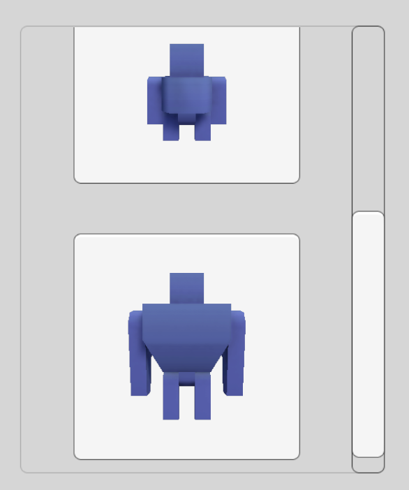
Each of the three character models needs to be updated to use this new material. Our characters are composed of multiple Mesh Renderers that all need to switch materials. You can select all the Mesh Renderers of all three character models at the same time to update their Material.
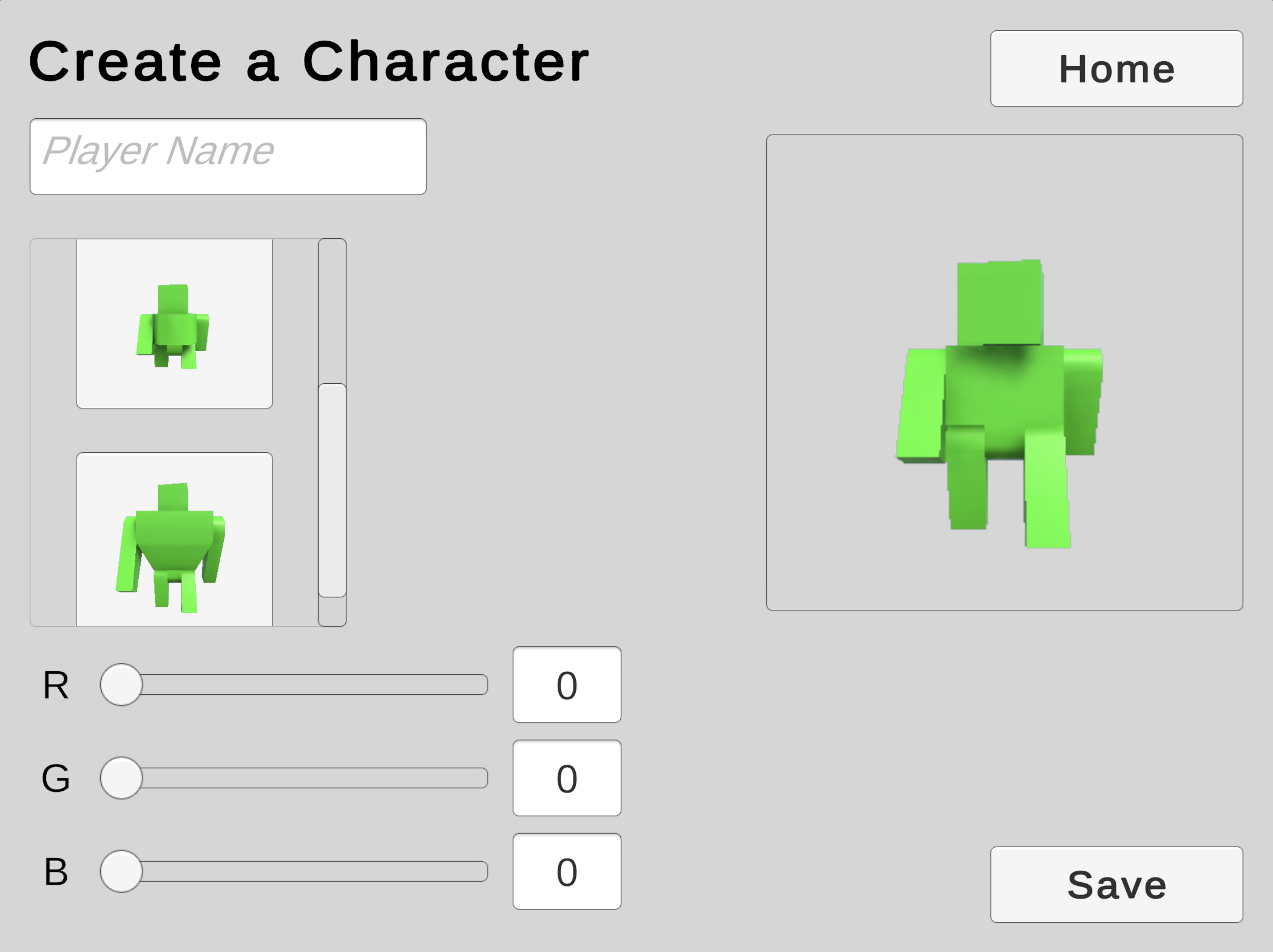
Now when you play the game, you'll see that all three character models have the default color from the new material.
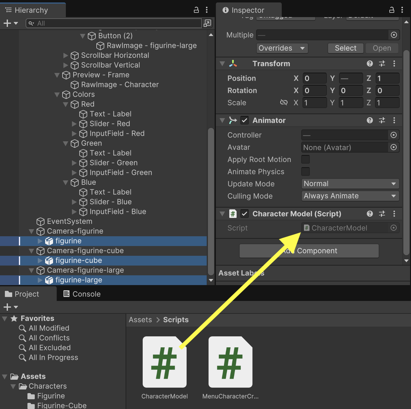
To help coordinate the colors of our models, we'll start a new CharacterModel component. CharacterModel will organize access to all of the MeshRenderers on a given character and provide functions for setting and getting the colors.
using UnityEngine;

public class CharacterModel : MonoBehaviour
{
	// Outlets
	MeshRenderer[] renderers;

	// Methods
	void Awake() {
		renderers = GetComponentsInChildren<MeshRenderer>();
	}

	public void SetColor(Color color) {
		foreach(MeshRenderer renderer in renderers) {
			renderer.material.color = color;
		}
	}

	public Color GetColor() {
		Color result = Color.black;
		if(renderers.Length > 0) {
			result = renderers[0].material.color;
		}
		return result;
	}
}
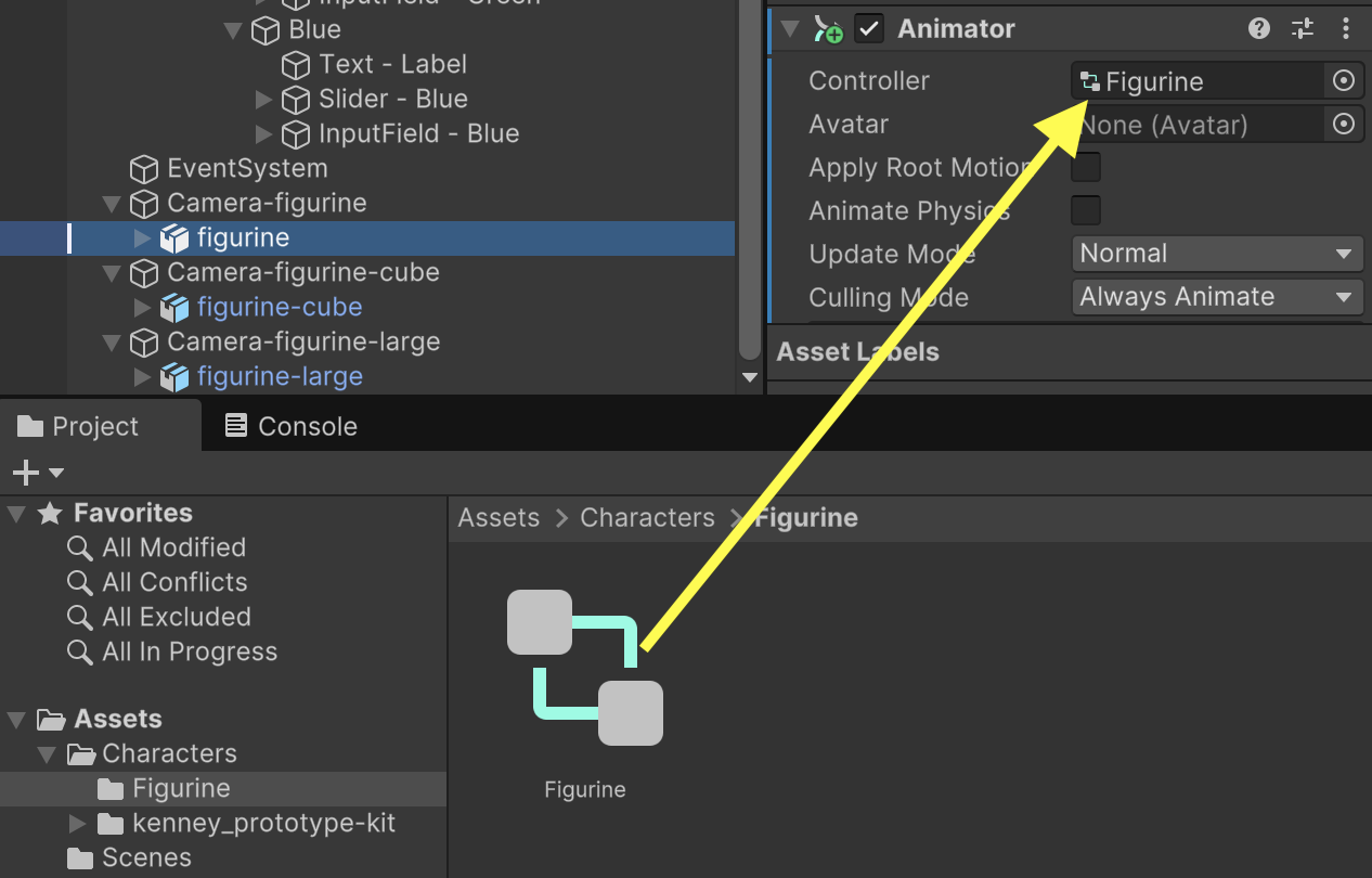
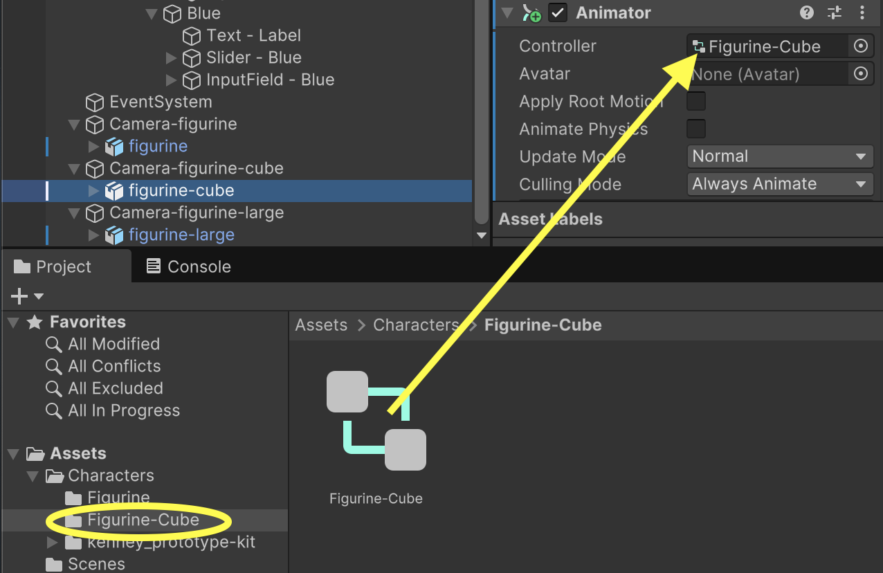
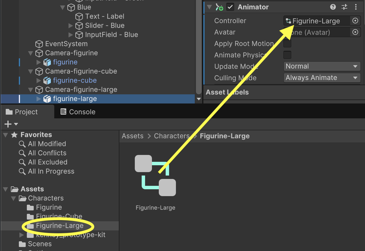
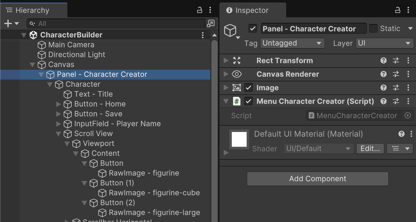
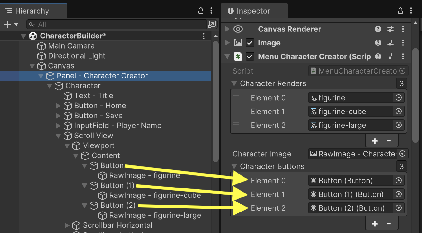
Adding an outlet to MenuCharacterCreator for referencing the Character Models will allow us to write logic coordinating the colors of the models.
using UnityEngine;
using UnityEngine.UI;
using TMPro;

public class MenuCharacterCreator : MonoBehaviour
{
	// Outlets
	public CharacterModel[] characters;
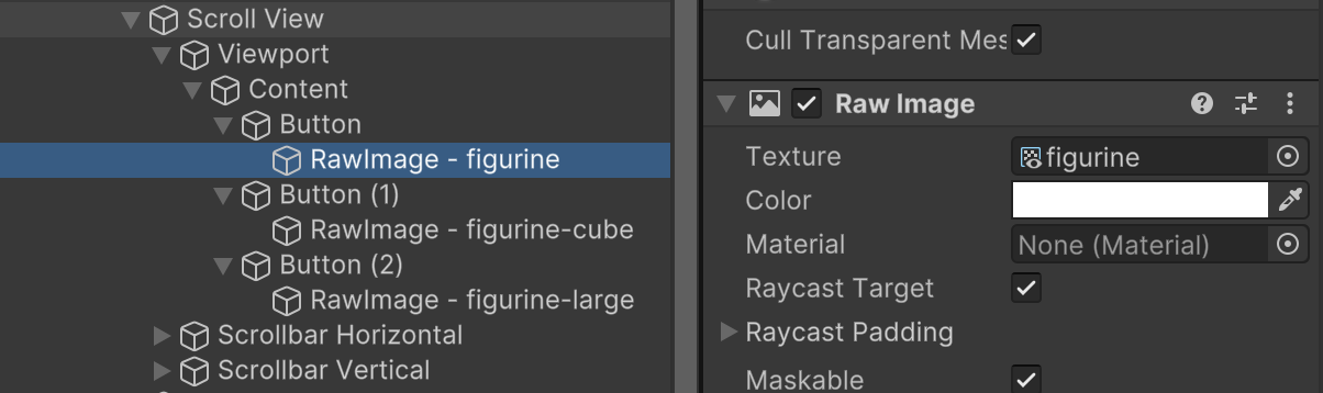
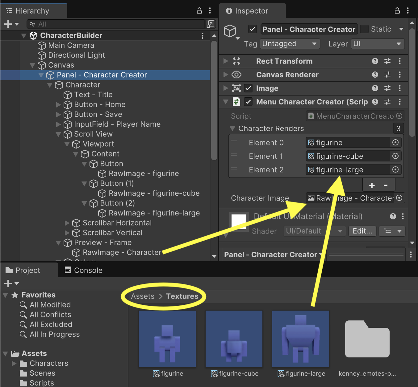
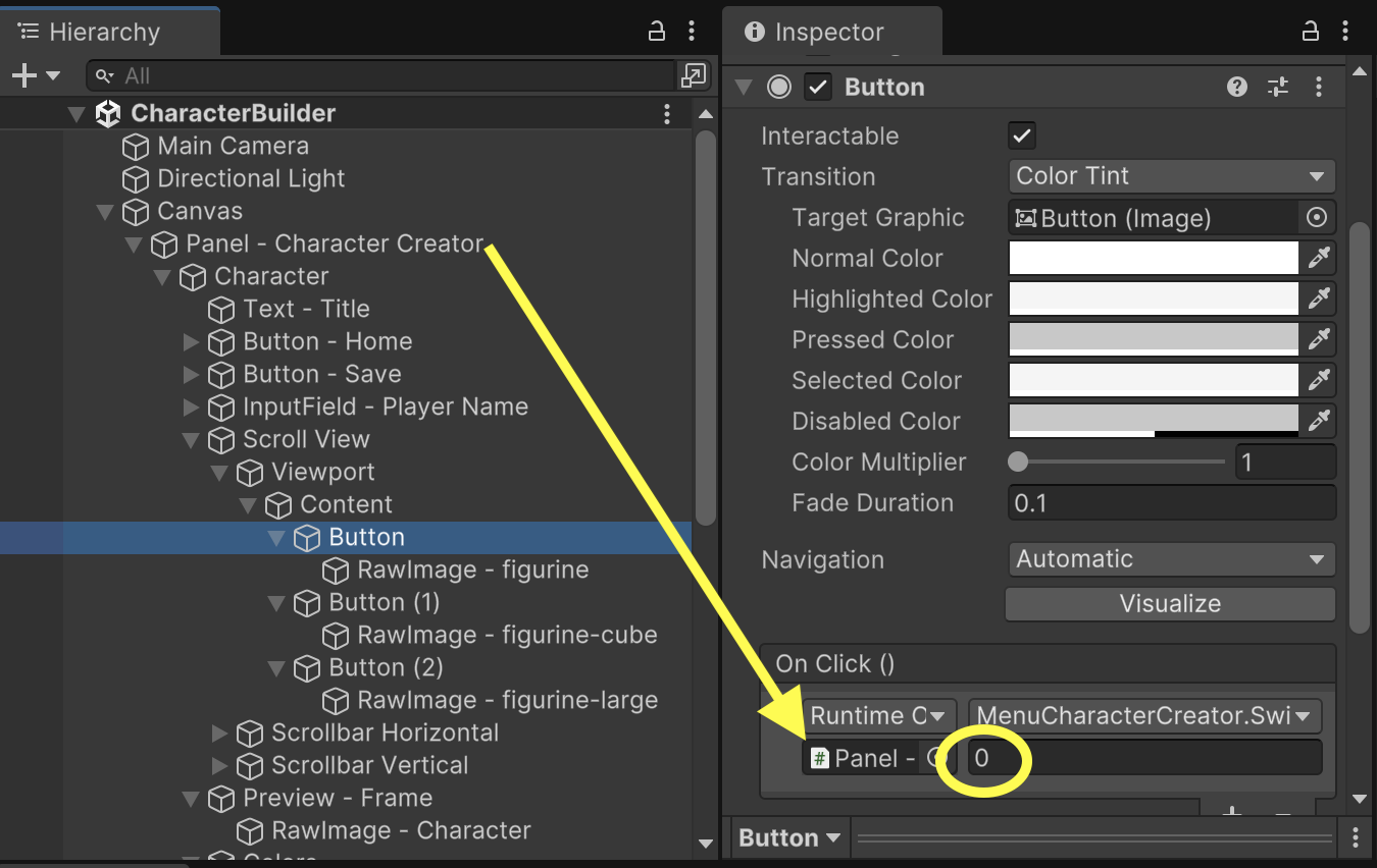
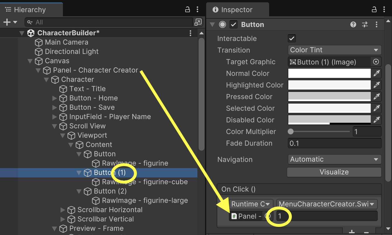
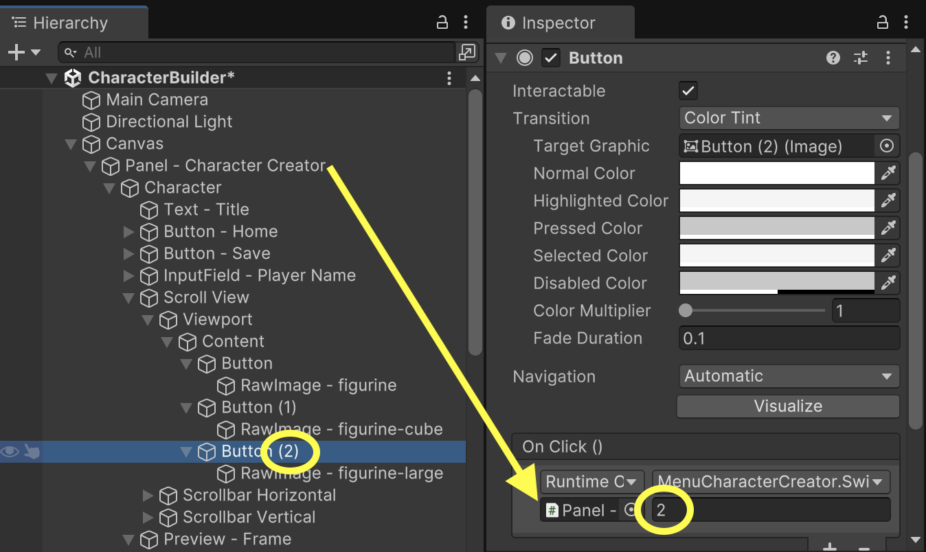
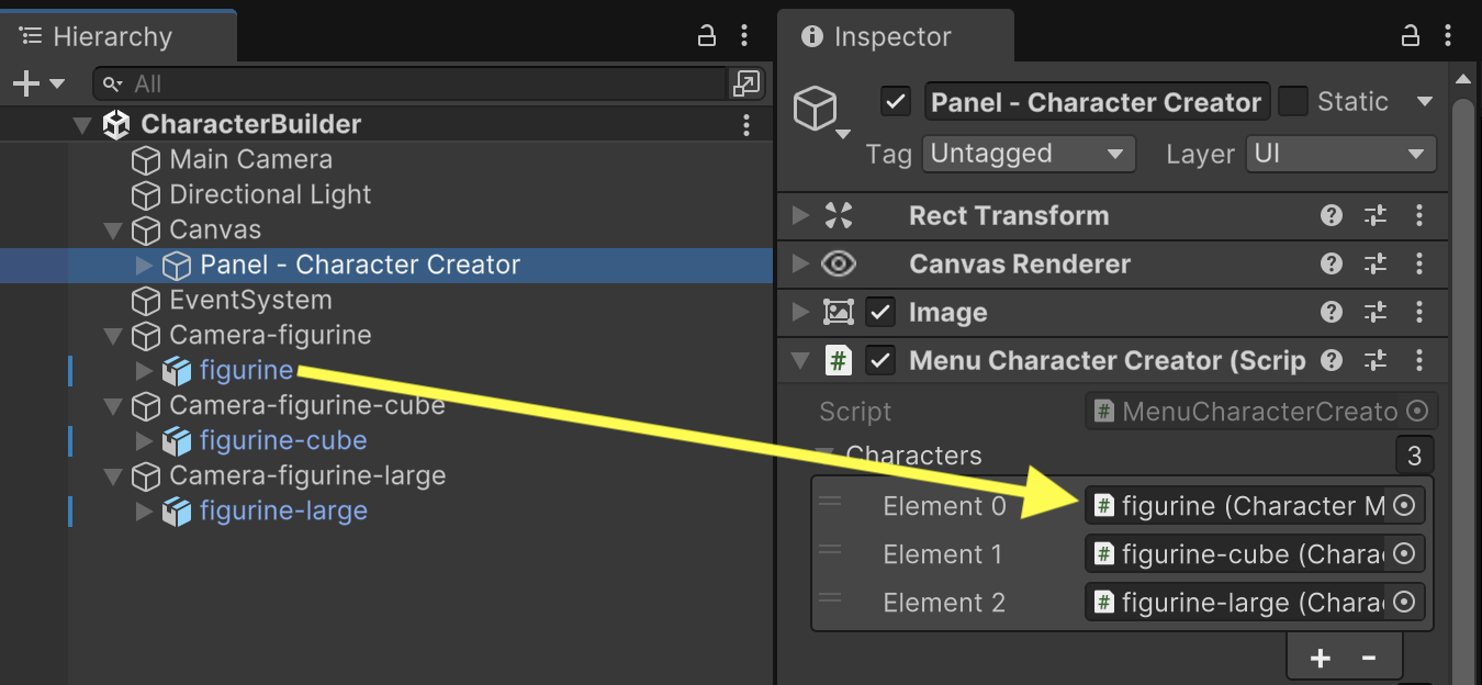
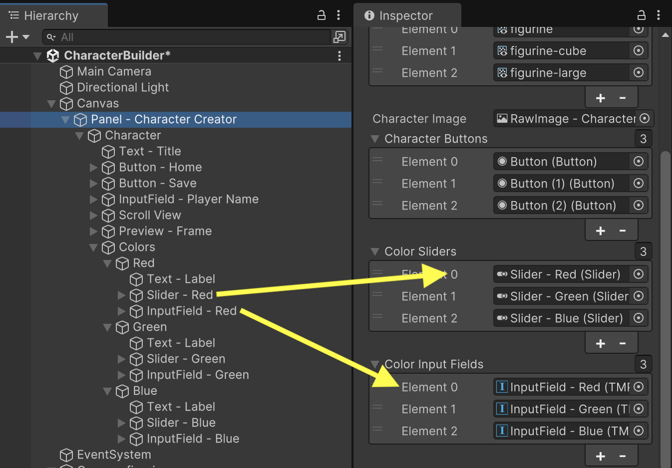
Fill in the Characters property maintaining the sequence that index 0 is figurine, index 1 is figurine-cube, and index 2 is figurine-large.
To help keep track of our color choices, we will add a state tracking variable to MenuCharacterCreator. (Keep in mind this line of code is temporary, and we will rearrange some of this logic in a future assignment when we implement save data. We will also add references to our various UI sliders and input fields to display current color measurements.
using UnityEngine;
using UnityEngine.UI;
using TMPro;
public class MenuCharacterCreator : MonoBehaviour
{
// Outlets
public CharacterModel[] characters;
public RenderTexture[] characterRenders;
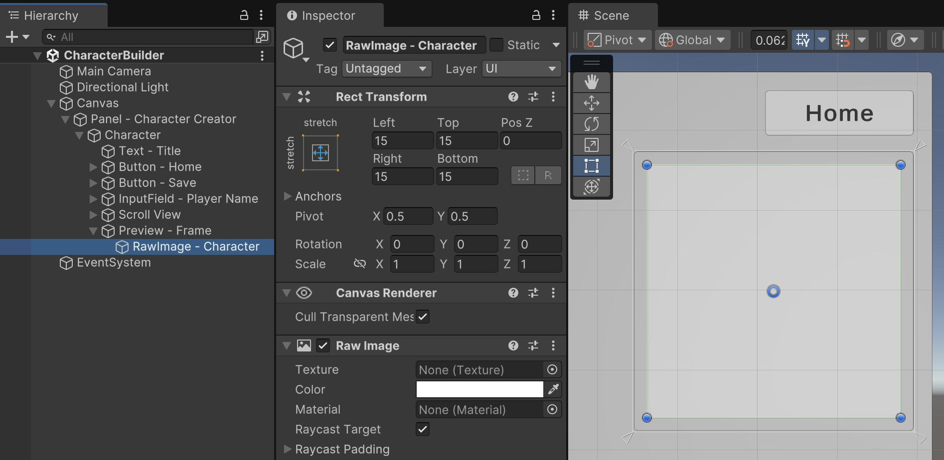
public RawImage characterImage;
public Button[] characterButtons;
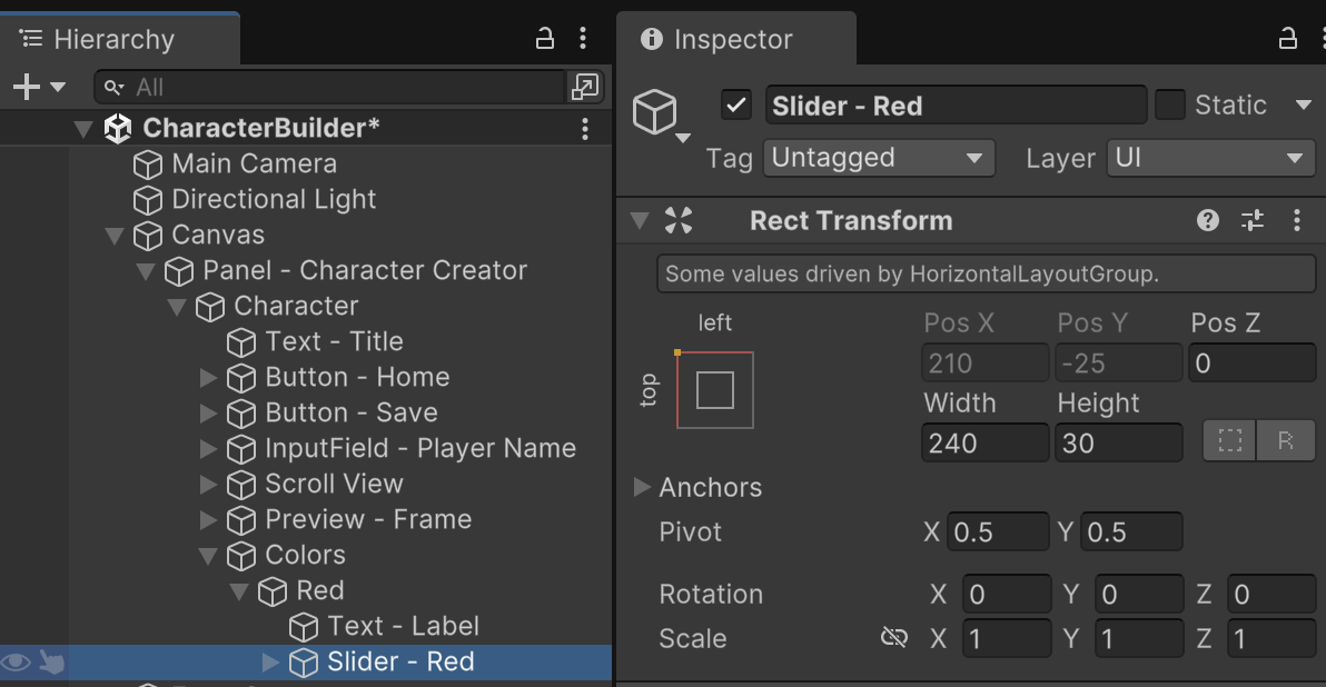
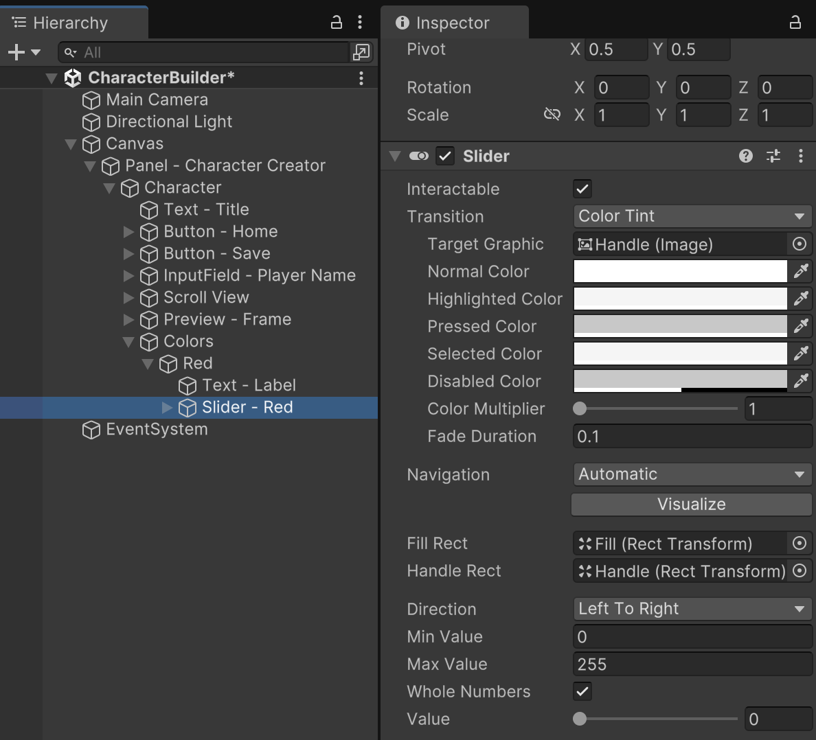
public Slider[] colorSliders;
public TMP_InputField[] colorInputFields;
// State Tracking
Color characterColor; // TEMPORARY. Will be replaced with save data.
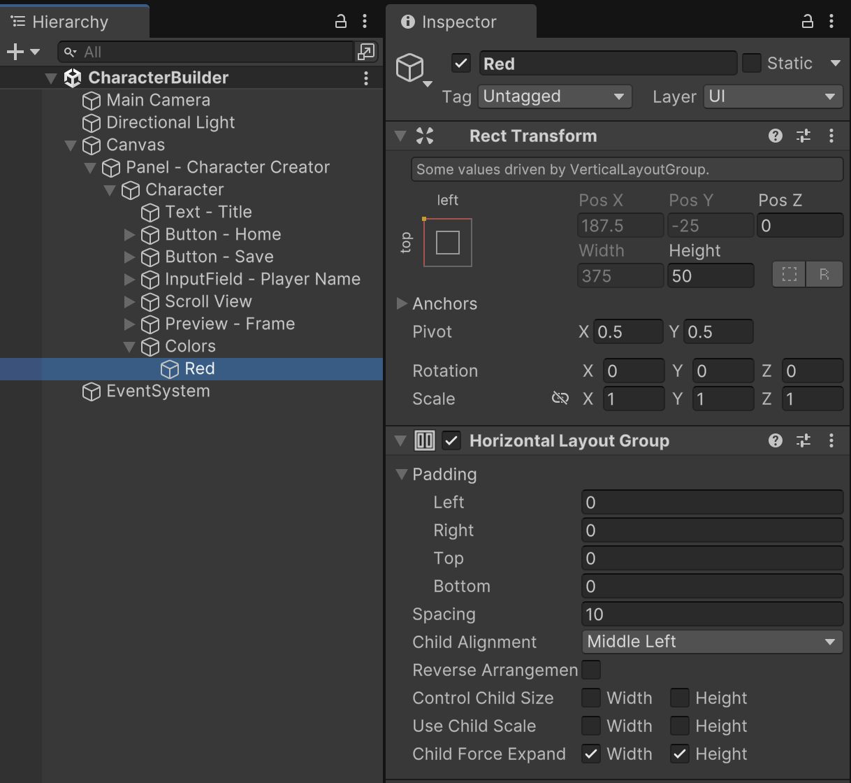
Fill in the new Slider and Input Field properties following an order in which index 0 is Red, index 1 is Green, and index 2 is Blue.
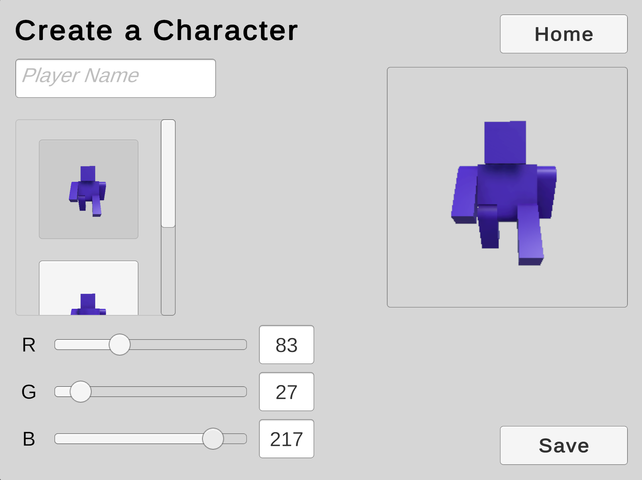
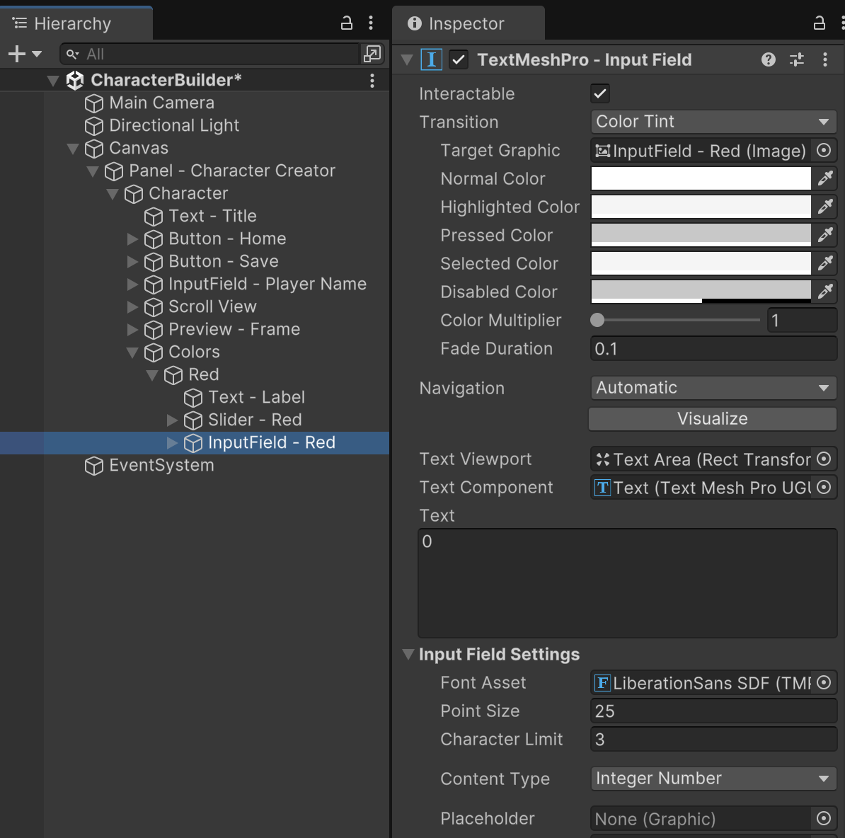
For any possible Color, we want our Sliders and Input Fields to display the matching RGB measurements. Add a SetColorUI function to MenuCharacterCreator to manage the display of color information. It's worth pointing out that some objects store color data from zero to one (where one is 100% strength), while other formats store color from 0 to 255. We convert between these ranges as appropriate throughout the code.
	void SetColorUI(Color color) {
		colorSliders[0].value = color.r * 255f;
		colorSliders[1].value = color.g * 255f;
		colorSliders[2].value = color.b * 255f;

		colorInputFields[0].text = Mathf.RoundToInt(color.r * 255f).ToString();
		colorInputFields[1].text = Mathf.RoundToInt(color.g * 255f).ToString();
		colorInputFields[2].text = Mathf.RoundToInt(color.b * 255f).ToString();
	}
Right now, the UI displays color RGB values of 0, even though our character has a default color. Let's add code that measures the default character color during the Start event of MenuCharacterCreator.
	// Methods
	void Start() {
		SwitchCharacter(0);

		// Read default character color
		if(characters.Length > 0) {
			// (All characters have the same color)
			characterColor = characters[0].GetColor();
		}
		SetColorUI(characterColor);
	}
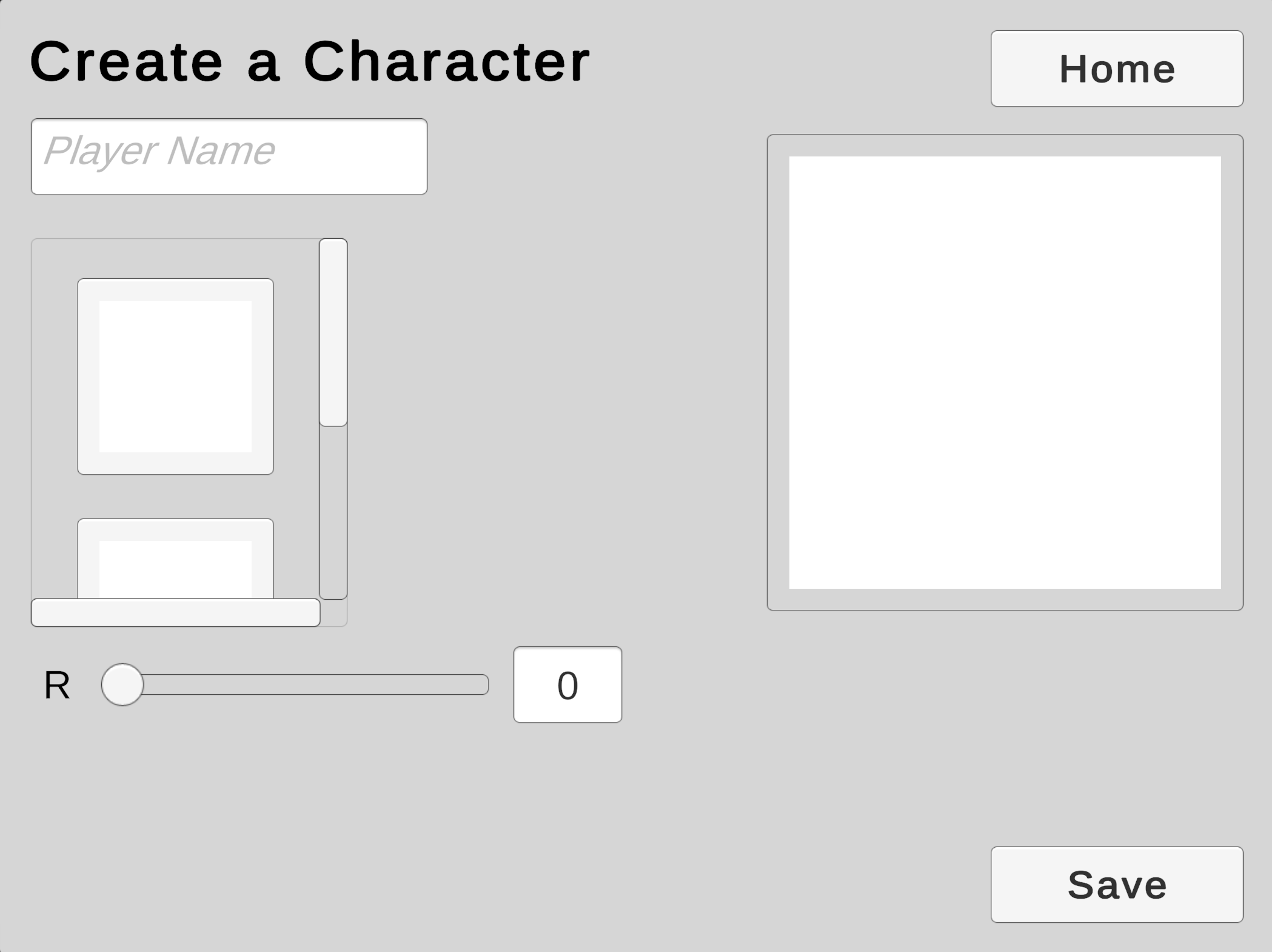
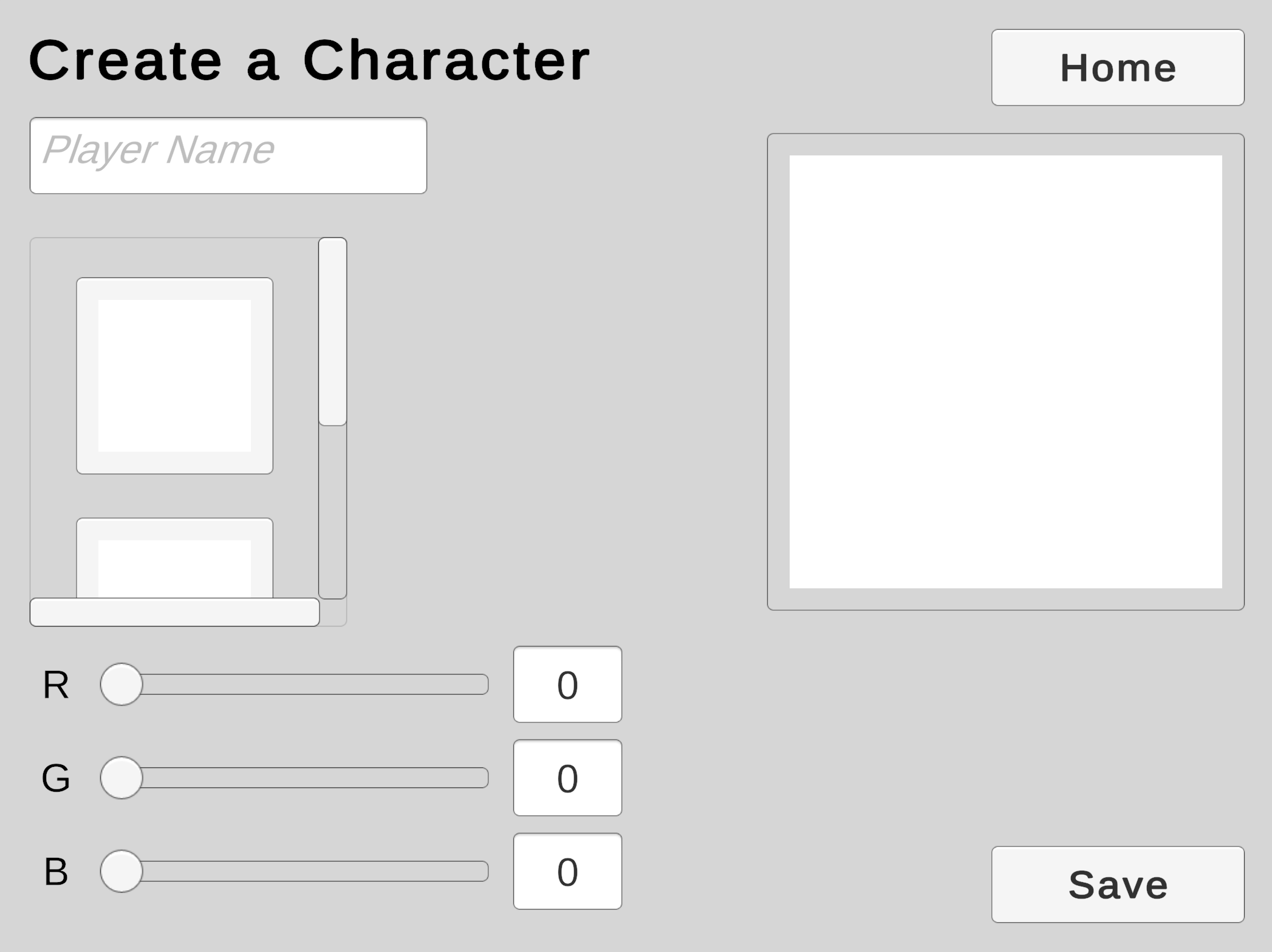
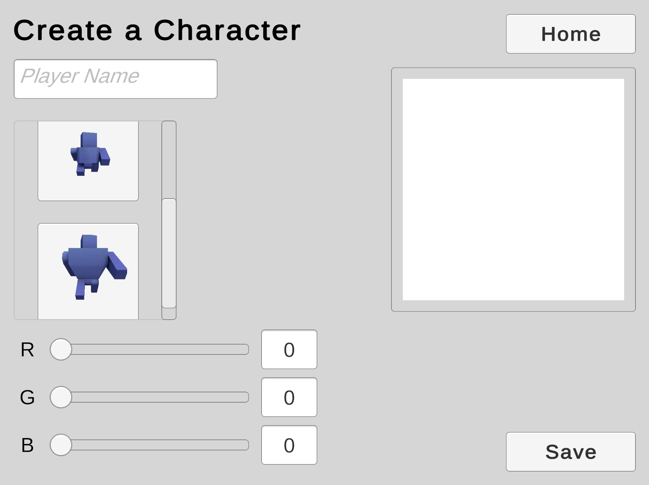
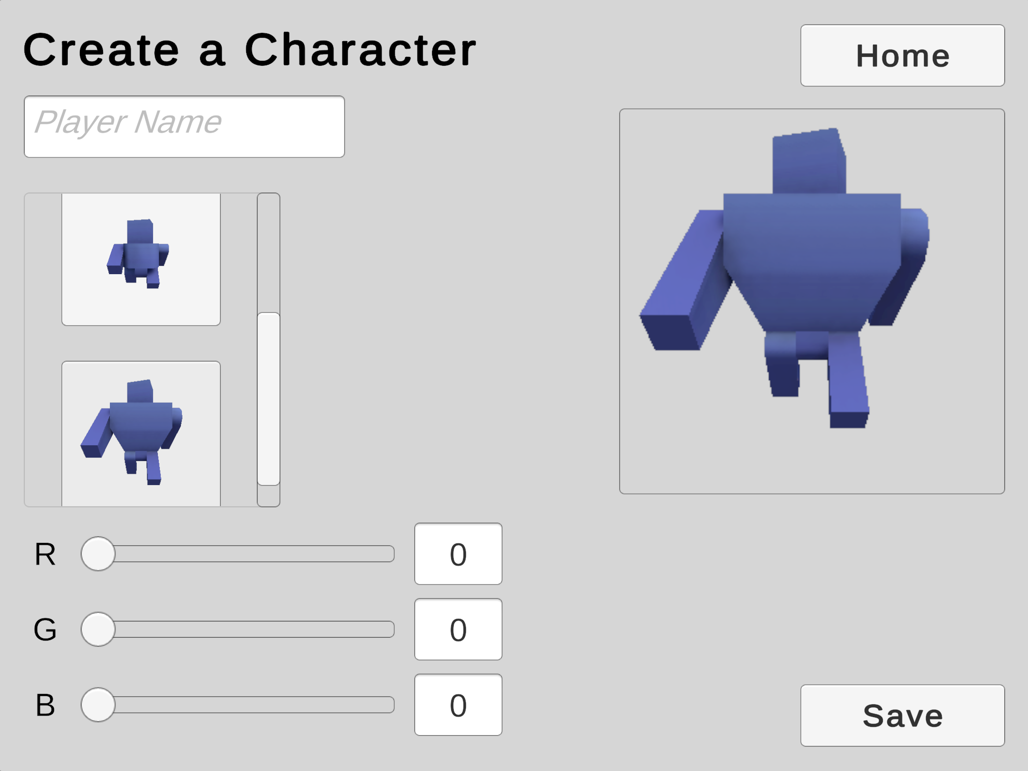
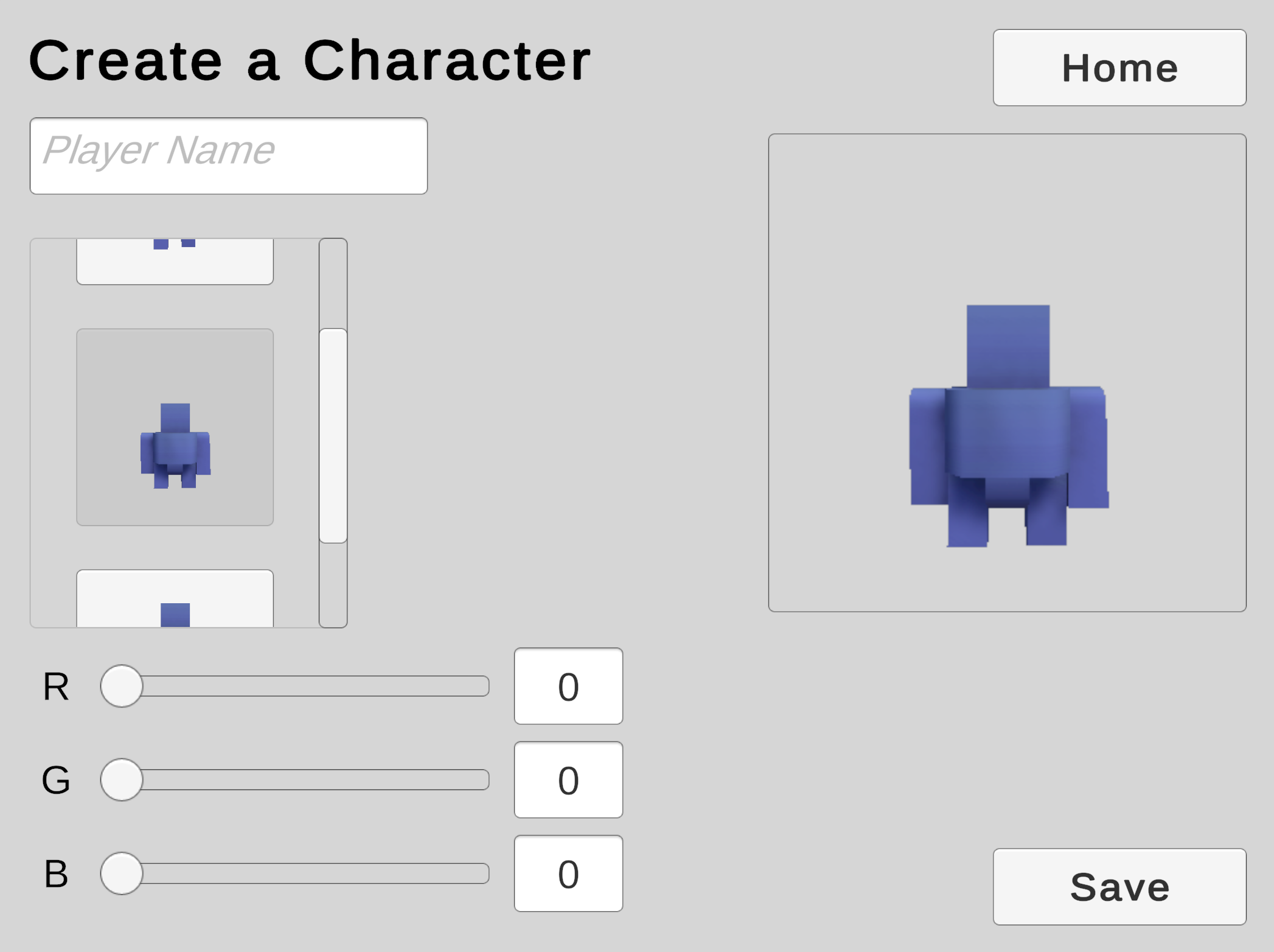
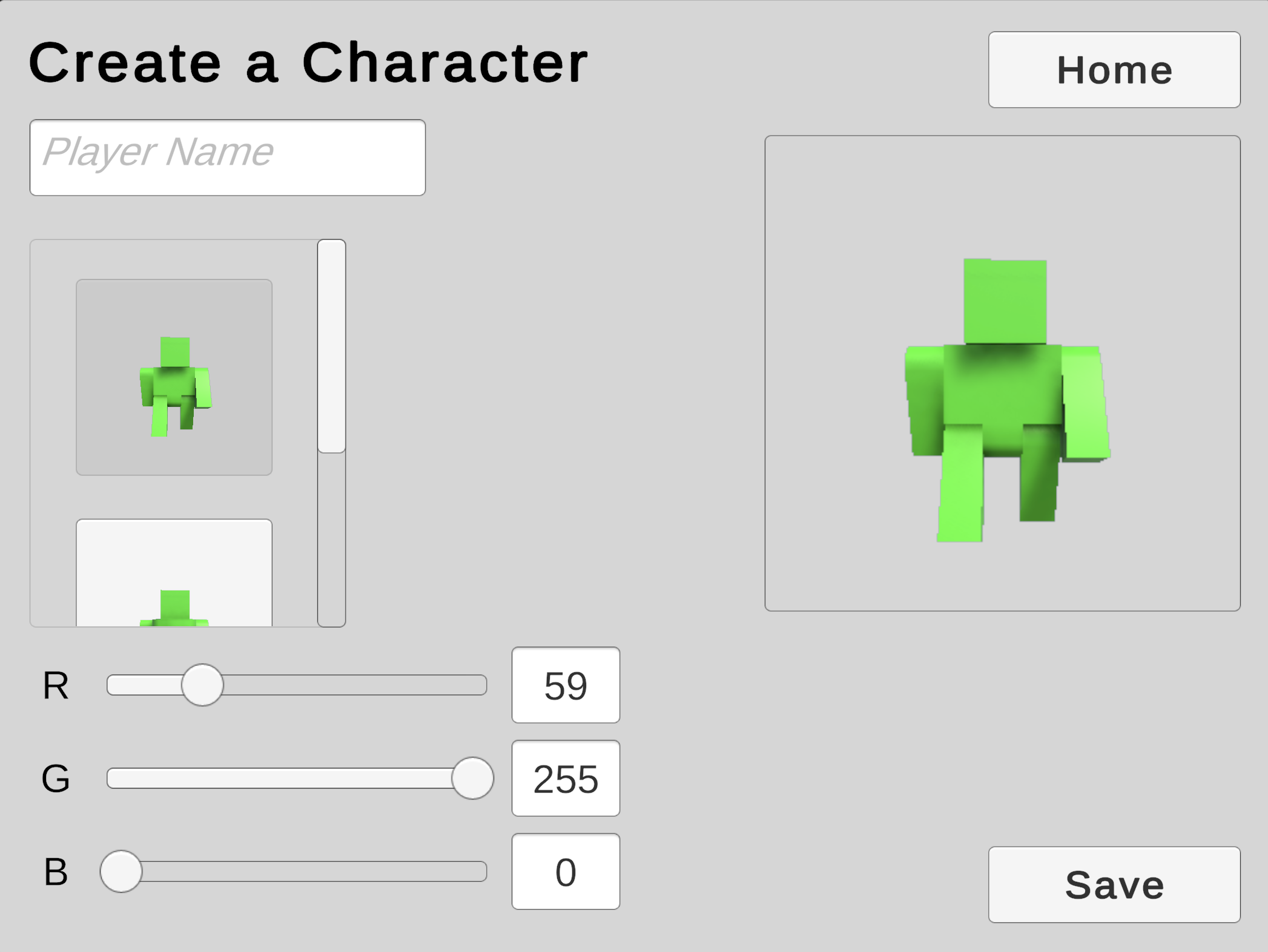
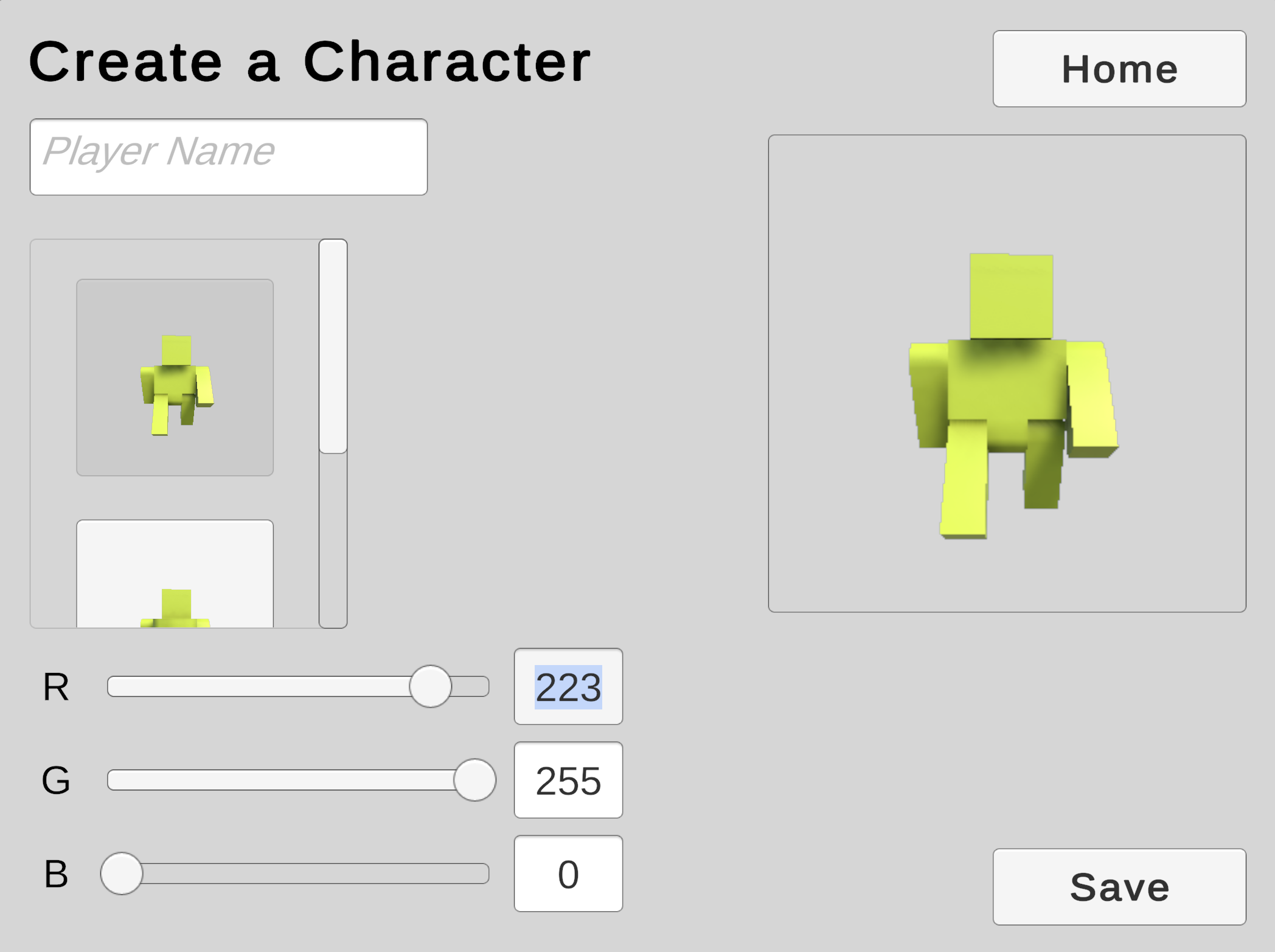
At the start of the game, the Sliders and Input Fields now show the correct RGB measurements. (Changing these values does not yet affect the model.)
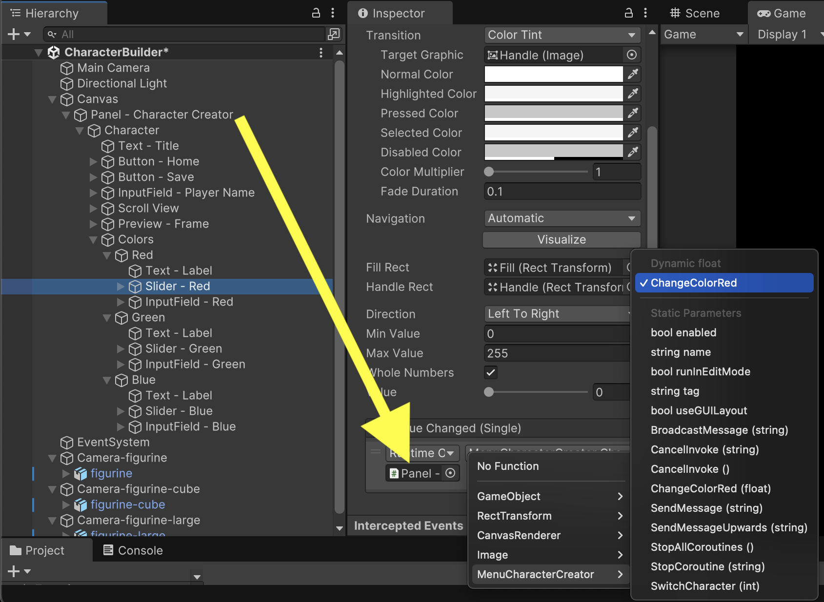
Players can change the color of the model by manipulating three separate Sliders and three Input Fields. Although this offers six possible interactions, we will only be altering one color channel at a time. To respond to player input, we'll start with a function that accepts a number 0 through 255 for controlling the Red color channel. Like a button event, this function is public so that outside components can access it.
	public void ChangeColorRed(float value) {
		characterColor.r = value / 255f;
		SetColorUI(characterColor);

		foreach(CharacterModel model in characters) {
			model.SetColor(characterColor);
		}
	}
The Red Slider will use this function for its OnValueChanged event.
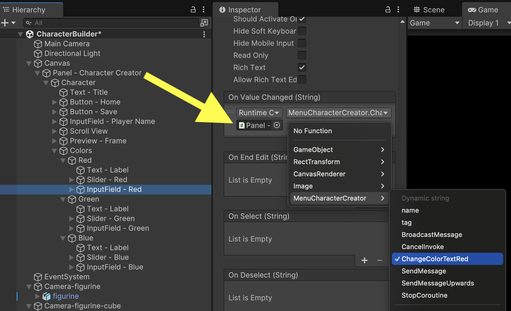
Unlike the Slider, InputField needs a function that receives strings instead of numbers. To use the ChangeColorRed function we already wrote, we'll add two more functions. ConvertToColor255 will convert a color string to a color number. ChangeColorTextRed will use ConvertToColor255 to call the ChangeColorRed function we wrote previously.
	float ConvertToColor255(string value) {
		// Convert string to number. Protect against empty or non-number strings
		float.TryParse(value, out float result);

		// Constrain to 0-255 color range
		if(result < 0) {
			result = 0;
		}
		if(result > 255) {
			result = 255;
		}

		return result;
	}

	public void ChangeColorTextRed(string value) {
		ChangeColorRed(ConvertToColor255(value));
	}
Similar to Slider, our Red InputField will use ChangeColorTextRed for its OnValueChanged event.
Playing the game now will reveal that you have full control for manipulating the Red color channel. The model changes color dynamically in response to live values from the Slider and the Input Field.
Repeat the previous steps for the Green and Blue channels. Remember to hook up component events for each color's Sliders and Input Fields.
	public void ChangeColorRed(float value) {
		characterColor.r = value / 255f;
		SetColorUI(characterColor);

		foreach(CharacterModel model in characters) {
			model.SetColor(characterColor);
		}
	}

	public void ChangeColorGreen(float value) {
		characterColor.g = value / 255f;
		SetColorUI(characterColor);

		foreach(CharacterModel model in characters) {
			model.SetColor(characterColor);
		}
	}

	public void ChangeColorBlue(float value) {
		characterColor.b = value / 255f;
		SetColorUI(characterColor);

		foreach(CharacterModel model in characters) {
			model.SetColor(characterColor);
		}
	}
	public void ChangeColorTextRed(string value) {
		ChangeColorRed(ConvertToColor255(value));
	}

	public void ChangeColorTextGreen(string value) {
		ChangeColorGreen(ConvertToColor255(value));
	}

	public void ChangeColorTextBlue(string value) {
		ChangeColorBlue(ConvertToColor255(value));
	}
Test all 6 combinations of Slider and Input Fields interactions to make sure the character model changes colors in response to all of them.